Water and Plant Correlation Chart – Data Visualization
RJ0800008_26
- Last Update 08/01/2025
- File Size 1.1MB
- # of Slides 2
- File Format PPTX
- Slide Ratio 16:9
- Color
Keywords
- #Content-Based Slides
- #Design-Based Slides
- #Product/Service Introduction
- #Diagram
- #Graph
- #Features
- #Cluster
- #Other
- #Closed Cluster Diagram
- #Radar Chart Spider Chart
- #16:9
- #radial diagram PowerPoint slide
- #center expansion diagram
- #relationship chart presentation
- #data visualization template
- #3-node diagram PowerPoint
- #business infographic slide
About the Product
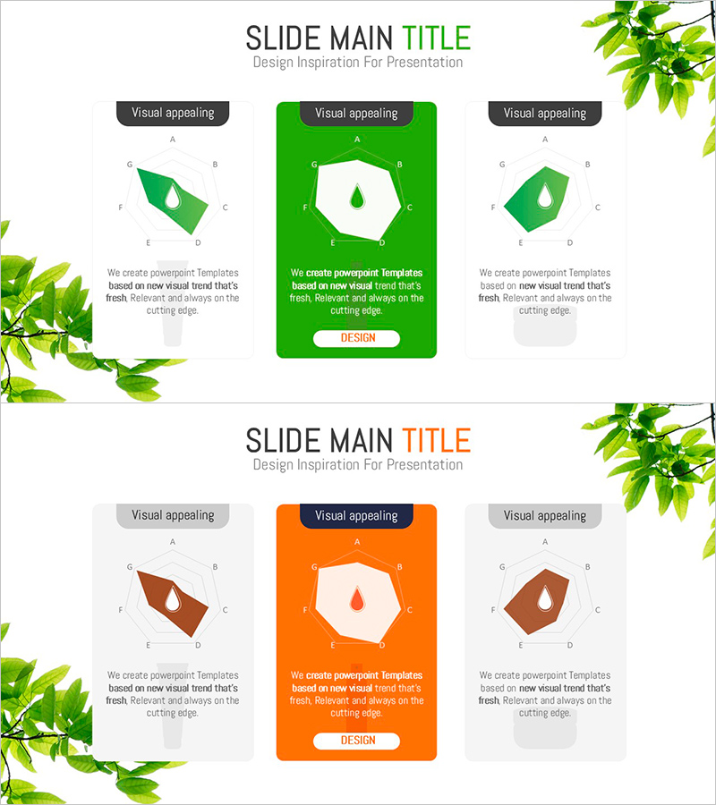
A radial diagram PowerPoint slide that visualizes relationships expanding from a central concept to surrounding elements. Available in two color versions—green and orange—each featuring a central hexagon node with three directional branches extending outward. Perfect for presenting water and plant correlations, core concepts with supporting details, or central themes with related components. The 2-slide deck in 16:9 widescreen format is ready to use immediately, with fully editable text labels and customizable node colors for your presentation needs.
Usage Points
-
Main Usage
Displays hierarchical relationships between a core concept and related elements using a center-outward radial structure. Ideal for illustrating water-plant correlations, organizational core values and execution strategies, product features and specifications, or any multi-faceted business relationship mapping.
-
How to Use
Enter your central concept in the hexagon node and place related items in the three directional nodes. Use the green version for growth, sustainability, and positive messaging; choose orange for energy, action, and attention-critical topics. All text labels and shape colors are fully editable to match your brand.
-
Recommended For
Environmental and sustainability presentations, organizational structure and role explanations, product feature analysis, market analysis and competitive positioning, project management and stakeholder mapping, educational seminars and training materials.
-
Slide Structure
2-slide set with identical radial layouts. Each slide features a central hexagon node (with label) connected by arrows to three directional nodes positioned at upper-left, upper-right, and bottom. Green version uses bright green background with white nodes; orange version features deep orange background with white nodes.
Related Products
-

Visualizing Features and Benefits with Radial Charts
#Product/Service Introduction #Diagram #Graph
-

Food Ingredient Characteristics Radar Chart – Features and Benefits
#Product/Service Introduction #Diagram #Graph
-

AI Neon Rhombus Visual Template – Product and Service Introduction
#Product/Service Introduction #Diagram #Features
-

Interior Essential Furniture – The Essence of Design
#Product/Service Introduction #Diagram #Features
