Bar Graph Visualization of Workplace Preferences
RJ0800004_25
- Last Update 08/01/2025
- File Size 5MB
- # of Slides 2
- File Format PPTX
- Slide Ratio 16:9
- Color
Keywords
- #Content-Based Slides
- #Design-Based Slides
- #Product/Service Introduction
- #Market and Competitor Analysis
- #Graph
- #Development Status
- #Market Analysis
- #Horizontal Bar
- #Segmented Horizontal Bar
- #16:9
- #horizontal bar chart PowerPoint
- #workplace preference survey slide
- #bar graph template
- #data comparison chart
- #employee satisfaction visualization
About the Product
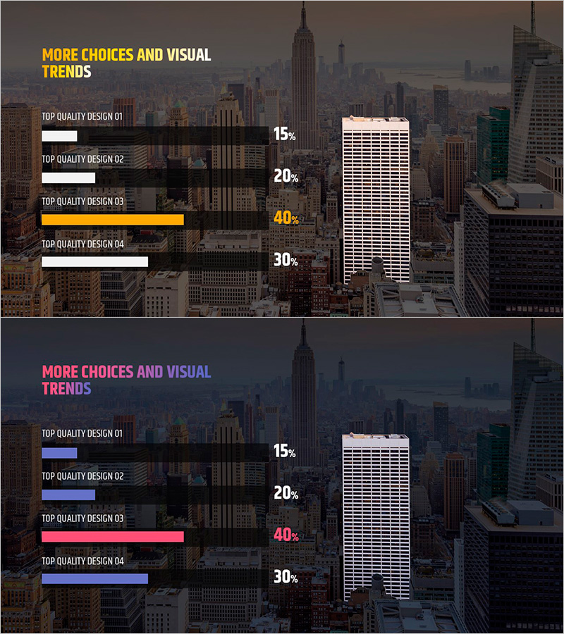
A PowerPoint slide visualizing workplace preference survey results using a horizontal bar chart. This presentation template features four items displayed as horizontal bars for direct comparison, with title area at the top and legend with data labels at the bottom. The design uses an orange accent bar and contrasting white and dark backgrounds to highlight key findings. Ideal for market analysis, employee satisfaction surveys, and preference comparison presentations. Includes 2 slides in PPTX format, ready to customize and present.
Usage Points
-
Main Usage
Visualize workplace preference surveys, employee satisfaction assessments, and market analysis results through data-driven horizontal bar comparisons. The 4-item bar structure clearly displays percentage or score differences across categories, making numerical comparisons immediately understandable to audiences.
-
How to Use
Use in HR department employee satisfaction presentations, marketing team market preference analysis, and executive summary sections. Modify bar lengths and colors to match your actual data, then update title and legend labels to fit your presentation context. Ready to use after data customization.
-
Recommended For
HR professionals, marketing analysts, business report writers, research teams, and organizational development specialists presenting employee preferences, satisfaction metrics, or market response data quantitatively.
-
Slide Structure
2-slide set. Slide 1: Title area + 4-item horizontal bar chart (one orange accent bar, three white/black bars) + percentage labels. Slide 2: Alternative color version (blue and pink accents) with identical layout. 16:9 widescreen format, PPTX file.
Related Products
-

Hexagon Diagram & Horizontal Bar Graph – Elevating Visual Appeal
#Product/Service Introduction #Market and Competitor Analysis #Graph
-

Camera Shooting App Analysis Graph – Visualization and Insights
#Product/Service Introduction #Market and Competitor Analysis #Graph
-

Manufacturing Analysis Graph – Market and Competitive Analysis
#Product/Service Introduction #Market and Competitor Analysis #Graph
-

Development Analysis Donut Graph – Visual Data Presentation
#Product/Service Introduction #Market and Competitor Analysis #Graph
