Growth Curve Area Graph - Market and Competitive Analysis
RJ0800004_21
- Last Update 07/31/2025
- File Size 1.2MB
- # of Slides 2
- File Format PPTX
- Slide Ratio 16:9
- Color
Keywords
- #Content-Based Slides
- #Design-Based Slides
- #Business Strategy
- #Market and Competitor Analysis
- #Graph
- #Other
- #Financial Outlook & Expected Impact
- #Future Outlook
- #16:9
- #growth curve area graph PowerPoint
- #market analysis chart slide
- #competitive comparison graph
- #data visualization PowerPoint
- #how to create area chart in PowerPoint
About the Product
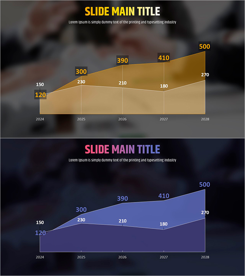
A PowerPoint slide featuring a growth curve area graph designed for market analysis and competitive comparison. This 2-slide set uses gold and blue color schemes to visualize year-over-year data trends from 2024 to 2028. Each slide displays numerical labels and gridlines for precise information delivery, enabling clear comparison of market growth rates, competitor market share, and revenue forecasts. The 16:9 widescreen PPTX format is fully editable and ready for corporate presentations, investor pitch decks, and strategic planning meetings. The stacked area chart structure makes it easy to track cumulative growth and relative performance across multiple data series.
Usage Points
-
Main Usage
This slide compares market growth trends and competitor market share using an area graph format. It enables stakeholders to quickly grasp year-over-year changes and is ideal for business strategy presentations, market status reports, and investor pitch decks where data credibility is essential.
-
How to Use
Input your actual market data or competitor revenue figures into the slide. Relabel the gold and blue areas as your company vs. competitors or Product A vs. Product B, then update the year-over-year numerical values. Insert into business plans, quarterly performance reports, and executive briefing materials.
-
Recommended For
Marketing managers, business planning teams, financial analysts, and executives presenting market analysis results. Particularly effective when entering new markets, tracking market share changes, or developing competitive strategies that require data-driven decision support.
-
Slide Structure
The 2-slide set includes a title area, subtitle text, one area graph per slide, 5 year-axis labels, and 10+ numerical data labels. Gridlines and legend elements clarify information hierarchy, while color contrast distinguishes between the two data series for easy interpretation.
Related Products
-

Visualizing Profit Outlook with Development and Growth Graphs
#Business Strategy #Market and Competitor Analysis #Graph
-

Analyzing Bank Delinquency Rate Trends with Stacked Area Chart
#Business Strategy #Market and Competitor Analysis #Graph
-

Food Truck Sales Rise Graph - Strong Business Strategy
#Business Strategy #Market and Competitor Analysis #Diagram
-

Visualizing the Changing Trend of the Ageing Population with a 100% Stacked Bar Graph
#Business Strategy #Market and Competitor Analysis #Marketing Plan and Strategy
