Food Satisfaction Survey with Pie Chart – Emphasizing Visual Appeal and Quality
RJ0800003_22
- Last Update 07/31/2025
- File Size 0.5MB
- # of Slides 4
- File Format PPTX
- Slide Ratio 16:9
- Color
Keywords
- #Content-Based Slides
- #Design-Based Slides
- #Financial Plans and Performance
- #Diagram
- #Graph
- #Sales and Revenue
- #Key Financial Indicators
- #Table
- #Circles
- #Pie Chart
- #16:9
- #pie chart PowerPoint slide
- #circular graph template
- #ratio visualization presentation
- #pie chart download
- #data visualization slides
About the Product
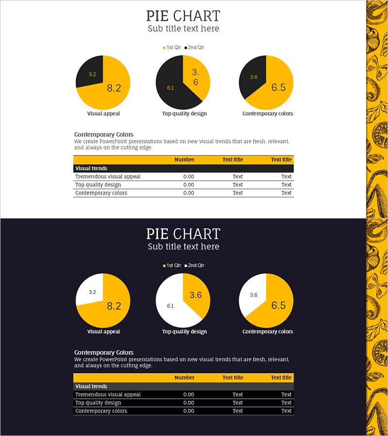
A professional pie chart PowerPoint slide set featuring a striking gold and black color scheme. Three circular graphs display different data ratios with supporting data tables below each chart for comprehensive information presentation. This presentation template is ready to use for satisfaction surveys, financial performance analysis, market share comparisons, and other data-driven presentations. The set includes 4 slides optimized for 16:9 widescreen format with fully editable chart elements.
Usage Points
-
Main Usage
Visualize proportional relationships and part-to-whole comparisons using pie charts. Ideal for presenting customer satisfaction metrics, market share distribution, budget allocation, and composition ratios in a clear, intuitive format.
-
How to Use
Double-click each pie chart to edit data values, and the proportions update automatically. Enter category names and figures in the data table below each chart. Choose between light or dark background versions to match your presentation environment and corporate branding.
-
Recommended For
Marketing professionals presenting customer satisfaction surveys, finance teams reporting budget allocation, sales teams analyzing market share, and executives presenting composition data. Suitable for consulting firms, financial institutions, and consumer goods companies requiring data-driven presentations.
-
Slide Structure
Slides 1-3 feature three pie charts (each with 2-segment divisions) paired with legend information and editable data tables. Slide 4 provides a dark background version with identical layout. All charts use editable data series for seamless customization.
Related Products
-

Line PPT Table (Green & Orange) – Visualizing Financial Performance Data
#Financial Plans and Performance #Diagram #Sales and Revenue
-

Orange Red Point Table – Visualization of Financial Performance
#Financial Plans and Performance #Diagram #Sales and Revenue
-

Minimal Block Table for Revenue and Profit Analysis – Emphasizing Financial Performance
#Financial Plans and Performance #Diagram #Sales and Revenue
-

Effective Data Table Slide – Financial Planning and Performance
#Financial Plans and Performance #Diagram #Sales and Revenue
