Orange Illustration Chart - Engaging Design and Functional Use
RJ0800002_26
- Last Update 07/31/2025
- File Size 0.4MB
- # of Slides 2
- File Format PPTX
- Slide Ratio 16:9
- Color
Keywords
About the Product
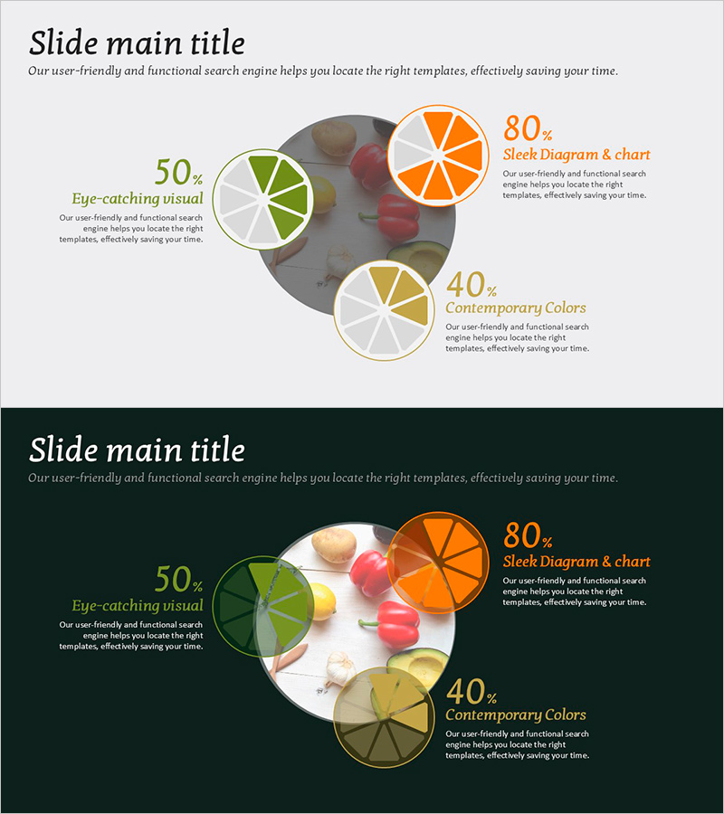
A 2-slide pie chart PowerPoint template optimized for ratio visualization with warm orange, green, and gold tones combined with fruit illustrations. Each chart segment displays percentage values and descriptive text to clearly communicate data meaning. Two versions provided—light background and dark background—allowing you to select based on presentation environment. Delivered in 16:9 widescreen PPTX format for immediate editing. Ideal for marketing reports, customer satisfaction analysis, market share explanations, revenue composition breakdowns, and any presentation requiring proportion-based data visualization.
Usage Points
-
Main Usage
Visualizes three-item percentage data such as market composition, customer satisfaction levels, or revenue distribution through an intuitive pie chart format. Each segment clearly displays numerical values and labels, enabling audiences to instantly grasp data meaning and proportional relationships.
-
How to Use
Select the slide version (light or dark background) matching your presentation environment. Edit percentage values and segment labels with your own data, and adjust colors as needed to align with corporate branding. Apply directly to marketing reports, business performance analysis, customer feedback presentations, and ratio-based discussions.
-
Recommended For
Marketing professionals, sales teams, executives presenting business performance, market analysts, product managers, and anyone requiring proportion-based data visualization in presentations such as market share analysis, revenue composition, customer satisfaction surveys, and strategic planning sessions.
-
Slide Structure
Two-slide composition featuring 3-segment pie charts. Each chart divides into orange (80%), green (50%), and gold (40%) segments with percentage values and descriptive text positioned to the right. One light-background version and one dark-background version included for flexible presentation adaptation.
Related Products
-

Bar Graph of Progress Analysis by Task - Effective Visualization of Progress
#Product/Service Introduction #Market and Competitor Analysis #Marketing Plan and Strategy
-

Potted Doughnut Chart for Market Analysis – Performance vs Sales
#Market and Competitor Analysis #Financial Plans and Performance #Graph
-

Vertical Bar Graph for Vision Growth – Business Development Strategy
#Company Introduction #Business Strategy #Graph
-

User Analysis Graph by Age Group – Advanced Data Insights
#Market and Competitor Analysis #Diagram #Graph
