Medical System Configuration Graph – Infographic for Market Analysis
RJ0700014_5
- Last Update 07/26/2025
- File Size 0.4MB
- # of Slides 2
- File Format PPTX
- Slide Ratio 16:9
- Color
Keywords
- #Content-Based Slides
- #Design-Based Slides
- #Product/Service Introduction
- #Market and Competitor Analysis
- #Diagram
- #Graph
- #Composition
- #Market Analysis
- #Cluster
- #Circles
- #Closed Cluster Diagram
- #Doughnut Chart
- #16:9
- #donut chart PowerPoint slide
- #medical system configuration diagram
- #4-segment pie chart template
- #healthcare infographic PPT
- #market analysis slide
- #how to create donut chart in PowerPoint
About the Product
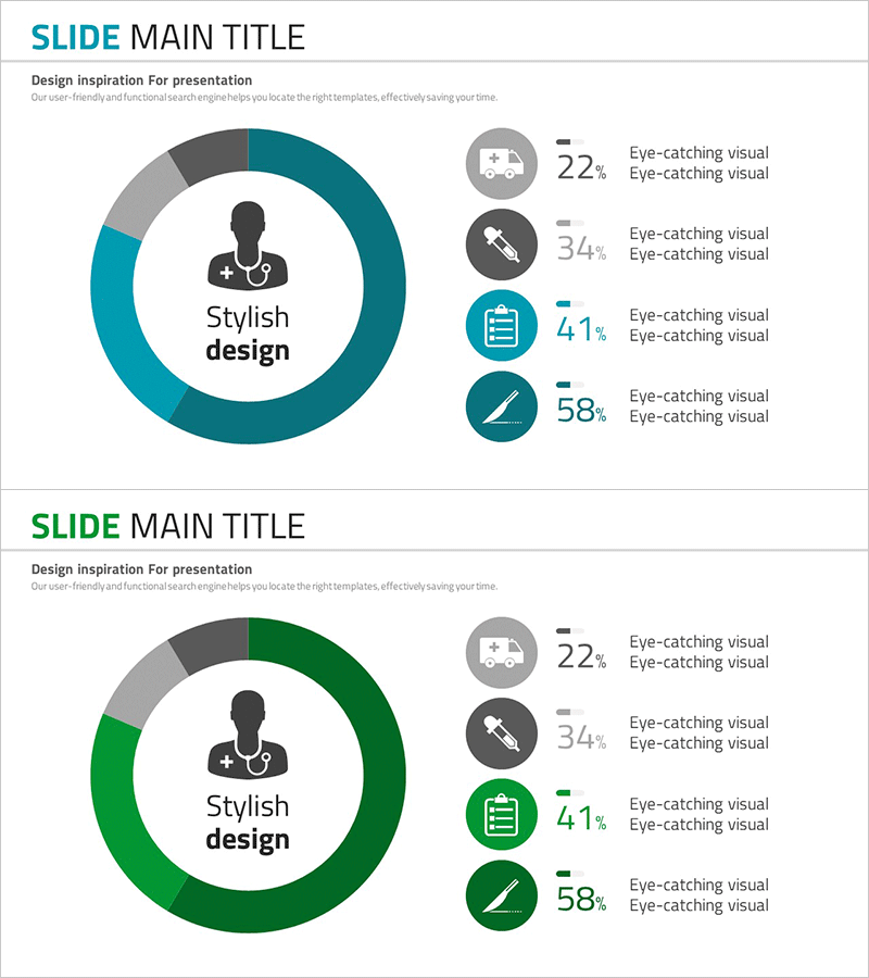
A donut chart PowerPoint slide that visualizes medical system configuration with four key segments arranged in a circular layout. The design features a central healthcare professional icon surrounded by four segments (Medical Services, Medical Devices, Medical Management, Medical Technology) in teal blue and gray tones, with percentage values displayed for each segment (22%, 34%, 41%, 58%). This infographic-style presentation effectively communicates the proportion and interrelationship of healthcare system components. Two slide variations are provided—teal blue and green versions—allowing flexible color selection to match your presentation theme. The 16:9 widescreen format ensures compatibility with modern presentation environments, and all elements are fully editable. Ideal for healthcare institutions, pharmaceutical companies, and healthcare enterprises presenting market analysis, business overviews, and strategic initiatives.
Usage Points
-
Main Usage
Visualize the composition and proportional weight of medical system components using a donut chart format. The central icon and outer segmented areas create a hierarchical structure that clearly shows the relationship between the main topic and detailed elements, while percentage values provide data-driven credibility and analytical depth.
-
How to Use
Use this slide in business presentations, market analysis reports, and strategic briefings for healthcare institutions, pharmaceutical companies, and healthcare enterprises. Customize the segment labels, percentages, and colors to represent organizational structures, product portfolios, customer segmentation, market share distribution, or any proportional data relevant to your healthcare narrative.
-
Recommended For
Healthcare executives, pharmaceutical marketing teams, healthcare startup founders, medical consultants, and hospital planning departments presenting business status, investor pitches, and market analysis. Particularly effective for B2B presentations requiring professional credibility and healthcare industry expertise.
-
Slide Structure
The donut chart features a central healthcare professional silhouette icon with four 90-degree segments in distinct colors (teal blue, light blue, dark gray, medium gray). The right side displays a vertical legend with four circular icons (Medical Services, Medical Devices, Medical Management, Medical Technology) paired with percentage values (22%, 34%, 41%, 58%). Two slide variations provide identical structure in teal and green color schemes.
Related Products
-

Health Checkup Data Analysis Circular Graph – Effective Business Data Visualization
#Product/Service Introduction #Market and Competitor Analysis #Diagram
-

Visualizing Genetic Research Data with a Donut Chart
#Product/Service Introduction #Market and Competitor Analysis #Diagram
-

Conveying Design Inspiration with Circular Diagram – Visually Appealing Presentation
#Product/Service Introduction #Market and Competitor Analysis #Graph
-

Business Task Analysis Pie Chart – Effective Market Analysis
#Product/Service Introduction #Market and Competitor Analysis #Graph
