Spending Growth Graph – Market and Competitive Analysis
RJ0800002_25
- Last Update 07/31/2025
- File Size 0.1MB
- # of Slides 2
- File Format PPTX
- Slide Ratio 16:9
- Color
Keywords
- #Content-Based Slides
- #Design-Based Slides
- #Market and Competitor Analysis
- #Financial Plans and Performance
- #Diagram
- #Graph
- #Market Analysis
- #Income Statement
- #Table
- #Line
- #Line Chart
- #16:9
- #line chart PowerPoint
- #spending trend slide
- #dual-series data visualization
- #market analysis chart
- #financial trend PowerPoint
- #multi-line graph template
About the Product
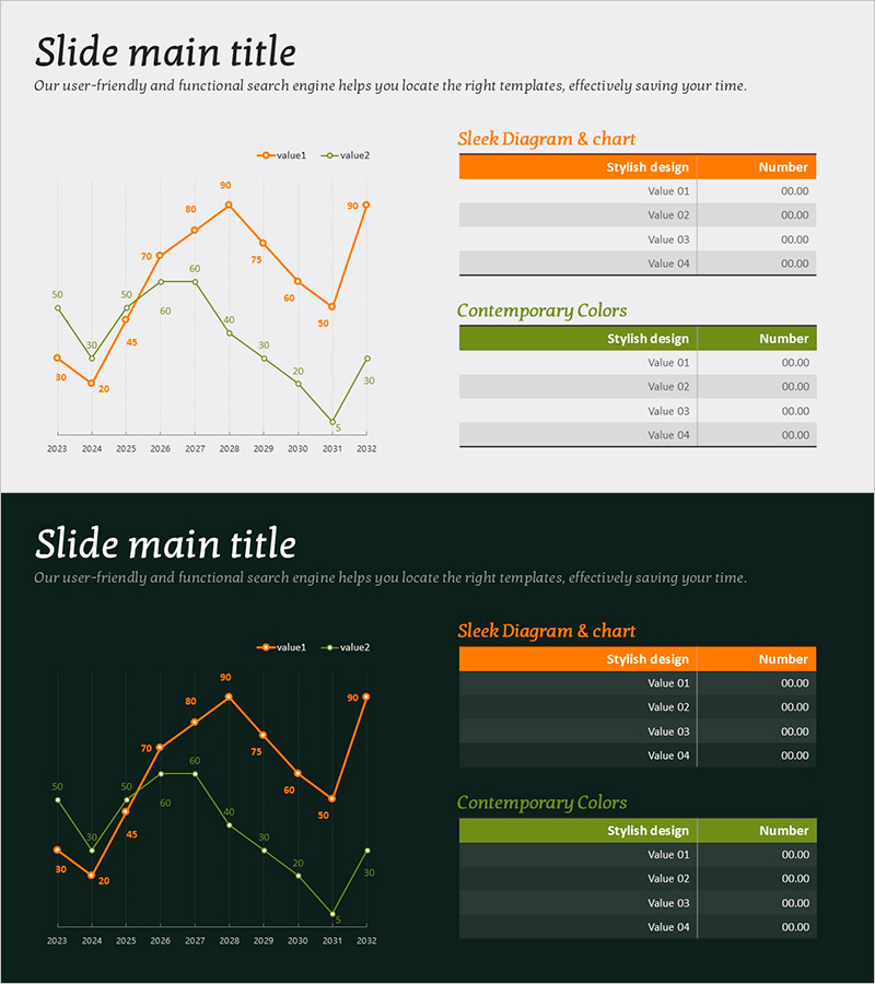
A multi-series line chart PowerPoint slide that compares spending growth rates across two data series over a 10-year period from 2023 to 2032. Orange and green line series clearly distinguish between two datasets, with each data point labeled with precise numerical values for accurate comparison. The right side features a legend table with color coding and value descriptions, making data interpretation straightforward. This presentation template is ready to use for financial reports, market analysis, competitive benchmarking, and any scenario requiring dual-metric trend visualization in business decks and analytical presentations.
Usage Points
-
Main Usage
Used in financial reports, market analysis documents, and competitive benchmarking presentations to simultaneously visualize how two key metrics change over time. Clearly displays spending patterns, revenue trends, growth rates, and other numerical data, enabling intuitive comparison of trends and gaps between the two series.
-
How to Use
Edit the data points and numerical labels with your actual dataset. Assign the orange line to your primary metric (e.g., company spending) and the green line to a comparison baseline (e.g., competitor spending or market average) to maximize contrast. Customize the legend table colors and labels to match your document context and data categories.
-
Recommended For
Ideal for finance team quarterly and annual performance reports, marketing team market share analysis, executive strategy meetings, investor presentations, and consulting reports requiring comparative analysis. Particularly effective when tracking and comparing performance across two departments, products, regions, or time periods.
-
Slide Structure
Title area at top, main line chart on left (X-axis: 2023–2032, Y-axis: numerical values, 2 line series with labeled data points), legend table upper right (orange header + 4 value rows), color description table lower right (green header + 4 value rows). 2-slide set, 16:9 aspect ratio, PPTX format.
Related Products
-

Competitor Market Analysis Table – Strategic Insights
#Market and Competitor Analysis #Diagram #Graph
-

Yellow Red Line Charts and Tables – Market Status Analysis
#Market and Competitor Analysis #Diagram #Graph
-

Apparel Industry Market Analysis Graph – Visualizing Growth Statistics
#Market and Competitor Analysis #Diagram #Graph
-

Target Market Analysis Line Graph – Visualizing Market Status
#Market and Competitor Analysis #Diagram #Graph
