Infographic Slide Highlighting the Antioxidant Function of Fruits
RJ0800002_14
- Last Update 03/30/2025
- File Size 0.7MB
- # of Slides 2
- File Format PPTX
- Slide Ratio 16:9
- Color
Keywords
- #Content-Based Slides
- #Design-Based Slides
- #Business Strategy
- #Financial Plans and Performance
- #Text Box
- #Financial Outlook & Expected Impact
- #Projected Return on Investment (ROI)
- #Arrow
- #16:9
- #comparison infographic PowerPoint slide
- #two-circle comparison diagram
- #business analysis slide
- #percentage comparison template
- #how to create comparison slides in PowerPoint
About the Product
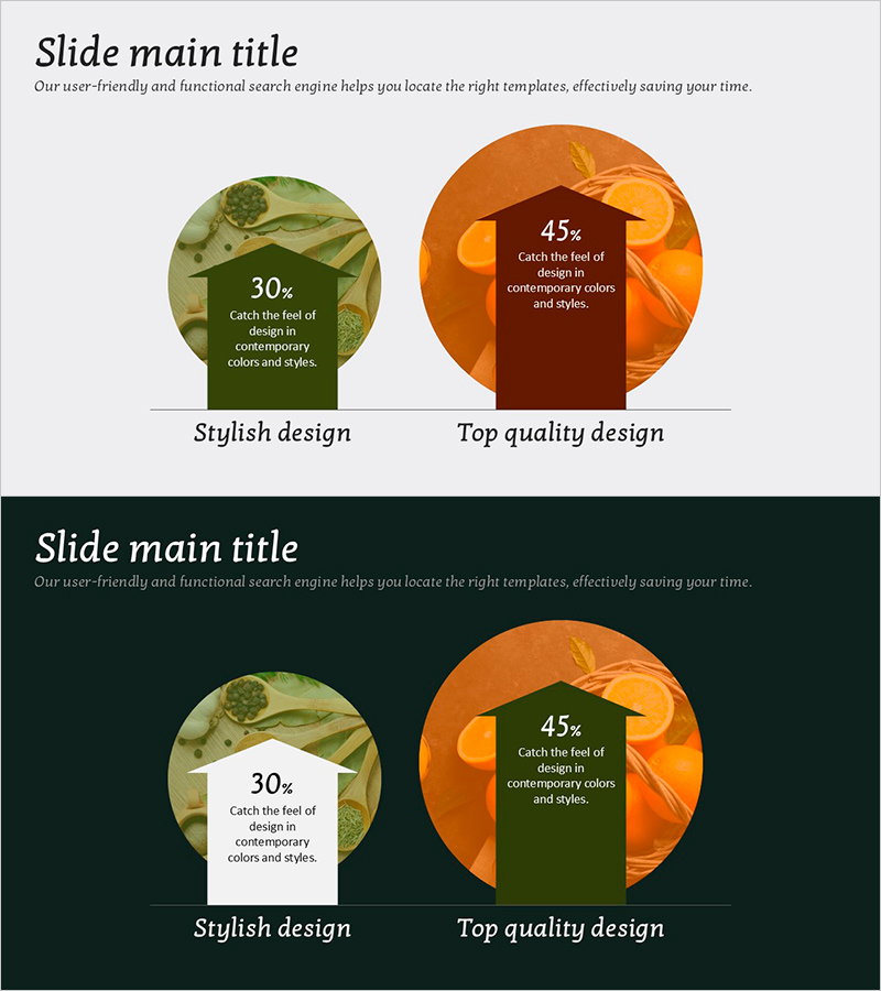
A two-circle infographic PowerPoint slide designed for visual comparison of two items or alternatives. The contrasting green and orange color scheme highlights each element, with percentage values and descriptive text positioned within circular shapes. Ideal for business strategy presentations, market analysis, and product comparisons where clear differentiation between two options is essential. Delivered in 16:9 widescreen PPTX format, fully editable to customize colors, percentages, and text for any presentation context.
Usage Points
-
Main Usage
Visualize two alternatives, competitive comparisons, market share data, or strategic options using circular infographic elements. The percentage-based layout emphasizes quantitative data, making it ideal for data-driven decision-making presentations.
-
How to Use
Edit the percentage values and descriptive text within each circle to reflect your actual data. Customize the green and orange colors to match your corporate branding, and update the title and subtitle to align with your presentation topic.
-
Recommended For
Marketing strategy presentations, business plan pitches, market analysis reports, product comparison decks, and investor pitch materials where two-way comparisons or alternative options need clear visual emphasis.
-
Slide Structure
Comprises a title and subtitle text area, a left circular infographic element with percentage and description, and a right circular infographic element with percentage and description, creating a balanced two-way comparison layout.
Related Products
-

Summer Vacation Template Table – Visualizing Financial Performance
#Financial Plans and Performance #Diagram #Projected Return on Investment (ROI)
-

Financial Planning and Scorecard Blue Orange
#Financial Plans and Performance #Diagram #Projected Return on Investment (ROI)
-

Camping Business Step-by-Step Future Plan Donut Chart
#Market and Competitor Analysis #Financial Plans and Performance #Graph
-

Environmental Pollution Infographic Table Template
#Financial Plans and Performance #Diagram #Projected Return on Investment (ROI)
