Vaccine Research Status Graph – Market and Competitive Analysis
RJ0700028_5
- Last Update 07/30/2025
- File Size 0.5MB
- # of Slides 2
- File Format PPTX
- Slide Ratio 16:9
- Color
Keywords
- #Content-Based Slides
- #Design-Based Slides
- #Market and Competitor Analysis
- #Diagram
- #Graph
- #Market Analysis
- #Cluster
- #Circles
- #Closed Cluster Diagram
- #Doughnut Chart
- #16:9
- #donut chart PowerPoint slide
- #pie chart template
- #market analysis graph
- #vaccine research presentation
- #4-segment donut diagram
- #competitive analysis PPT
About the Product
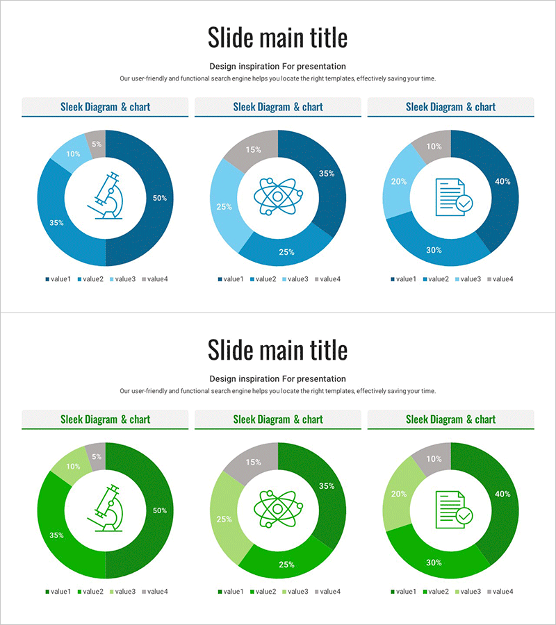
A PowerPoint slide featuring donut-shaped pie charts designed for vaccine research status and market competitive analysis. The template includes three color schemes (navy blue, light blue, and gray) with four-segment donut charts paired with distinct icons (microscope, atom, checklist) on each slide. Percentage values and legends are clearly displayed to effectively communicate market share, competitor comparison, and research progress data. This 2-slide presentation template is ready to use in reports, pitch decks, and business proposals.
Usage Points
-
Main Usage
Visualize vaccine research status, market share, and competitive analysis using donut-shaped pie charts. The four-segment design with color differentiation and percentage labels enables audiences to quickly grasp quantitative data and market positioning.
-
How to Use
Use in market analysis, competitive landscape, and research progress sections of presentations. Customize icons and colors to match your document theme for business plans, investor pitch decks, and product introduction materials.
-
Recommended For
Recommended for pharmaceutical researchers, marketing professionals, and business strategists presenting market analysis findings. Ideal for government-funded project reports, academic presentations, and executive briefings requiring data-driven decision support.
-
Slide Structure
2-slide set. Each slide contains one 4-segment donut pie chart with a centered icon (microscope, atom, or checklist), surrounded by color-coded segments, percentage values, and legend. Navy blue, light blue, and gray gradient tones create visual hierarchy for data representation.
Related Products
-

Medical System Configuration Graph – Infographic for Market Analysis
#Product/Service Introduction #Market and Competitor Analysis #Diagram
-

Healthcare Services Analytics Donut Chart – Insights into Competitive Markets
#Market and Competitor Analysis #Diagram #Graph
-

Visualizing Genetic Research Data with a Donut Chart
#Product/Service Introduction #Market and Competitor Analysis #Diagram
-

Business Idea Development Analysis Circle Graph
#Business Introduction #Market and Competitor Analysis #Diagram
