AI Service Market Share Graph – Visualized Data Insights
RJ0700025_13
- Last Update 10/04/2025
- File Size 1.3MB
- # of Slides 2
- File Format PPTX
- Slide Ratio 16:9
- Color
Keywords
- #Content-Based Slides
- #Design-Based Slides
- #Business Vision and Strategy
- #Market and Competitor Analysis
- #Diagram
- #Graph
- #Other
- #Business Strategy
- #Market Share
- #Flow
- #Converging Flow Diverging Flow
- #16:9
- #circular gauge chart PowerPoint
- #donut chart slide template
- #ratio comparison visualization
- #market share graph
- #data visualization PowerPoint slide
About the Product
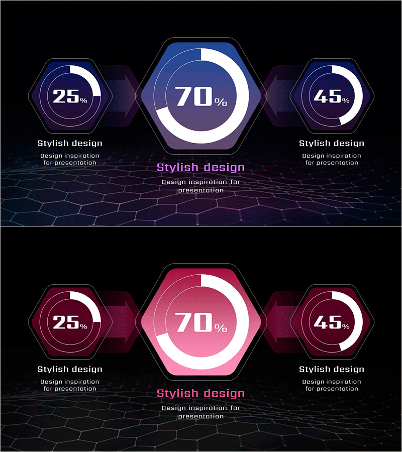
A PowerPoint slide featuring circular gauge charts to visualize AI service market share data. The design combines a large central donut-shaped gauge (70%) with two smaller gauges (25%, 45%) on either side, creating a clear hierarchical data representation. Set against a dark background with blue and pink dual-tone colors, the slide incorporates hexagonal frames and geometric patterns for a tech-forward aesthetic. The 2-slide set is optimized for 16:9 widescreen format and works seamlessly across all devices. Perfect for business strategy presentations, market analysis reports, investor pitches, and quarterly performance reviews where data-driven insights need compelling visual support.
Usage Points
-
Main Usage
Designed to compare multiple ratio datasets in a hierarchical structure. The large central gauge emphasizes the primary metric (70%), while the flanking smaller gauges display related figures side-by-side for instant comparative analysis. Ideal for visualizing AI market share, revenue distribution, customer satisfaction scores, and other percentage-based data across business contexts.
-
How to Use
Deploy in business strategy presentations, market analysis reports, investor relations (IR) meetings, and quarterly performance briefings to highlight key metrics. Simply edit the gauge values and labels with your actual data—the slide is immediately ready to use. Colors, background, and gauge styling can be customized to match your corporate brand guidelines.
-
Recommended For
Executives, marketing managers, data analysts, business consultants, and investor relations professionals. Particularly suited for tech, AI, finance, and telecommunications industries where data-driven storytelling is essential. Effective whenever quantitative achievements must be communicated with high visual impact and credibility.
-
Slide Structure
2-slide set, each featuring three gauge elements: one large central circular gauge (70% display) and two smaller gauges (25% and 45% display). Blue and pink dual-tone color scheme with hexagonal frames and geometric patterns on dark background create a technology-focused aesthetic. 16:9 widescreen format, PPTX file type, fully editable in all PowerPoint versions.
Related Products
-

Halloween Hats and Pumpkin Charts – Ideal for Market Analysis
#Market and Competitor Analysis #Graph #Other
-

Simple Car Wide Presentation Map&Donut Chart – Market Share Analysis
#Market and Competitor Analysis #Graph #Other
-

Analyzing ABC District Occupancy with Doughnut Chart
#Market and Competitor Analysis #Graph #Other
-

Graph Showing Distribution Status by Country – Market Share Analysis
#Market and Competitor Analysis #Graph #Other
