Green Orange Market Share Visualization – Data-Driven Insights
RJ0600103_15
- Last Update 07/18/2025
- File Size 1.1MB
- # of Slides 2
- File Format PPTX
- Slide Ratio 16:9
- Color
Keywords
- #Content-Based Slides
- #Design-Based Slides
- #Market and Competitor Analysis
- #Graph
- #Other
- #Market Share
- #Market Overview
- #Circles
- #Doughnut Chart
- #Map
- #16:9
- #world map PowerPoint slide
- #regional market share visualization
- #donut chart template
- #geographic data presentation
- #global business analytics slide
About the Product
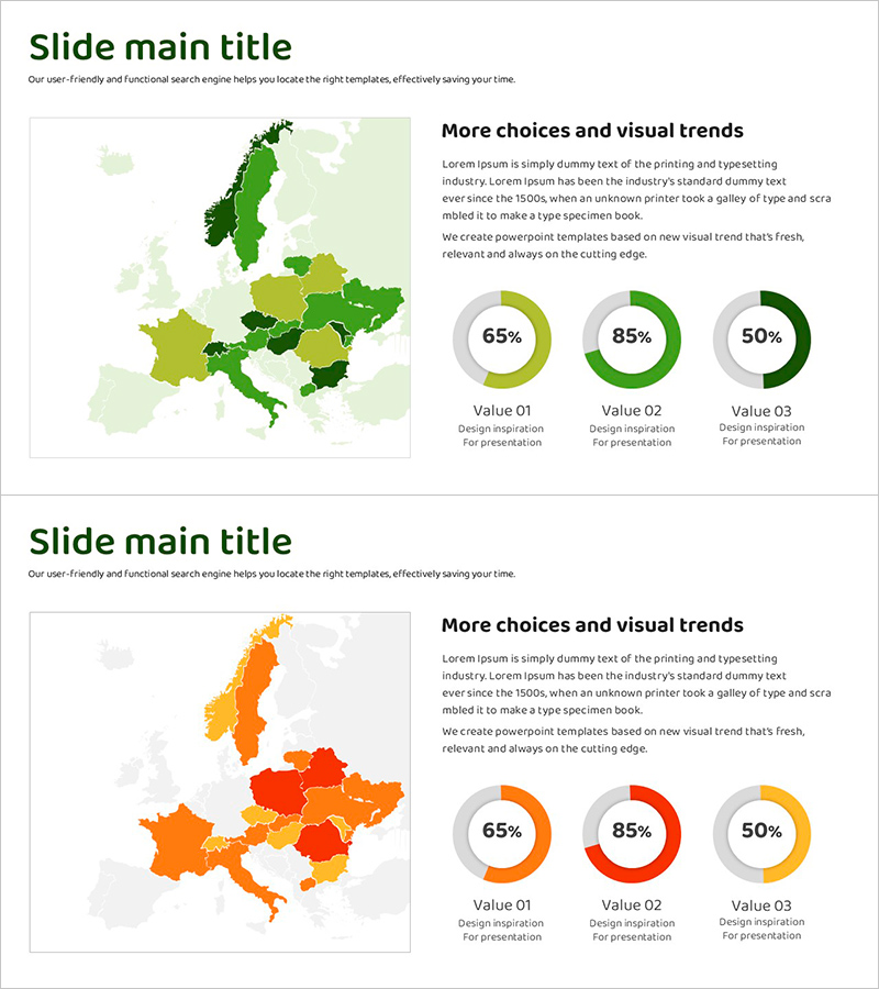
A data-driven PowerPoint slide combining a European map with donut charts to visualize regional market share distribution. The template uses multi-tone color gradients in green, orange, and red to represent regional variations in market penetration, with three percentage metrics displayed simultaneously. Two slide layouts offer distinct color schemes—green-toned and orange-red-toned—allowing flexible adaptation to corporate branding and presentation themes. The intensity variation across map regions paired with precise donut chart percentages creates a comprehensive visual narrative for global market analysis, regional sales performance, and customer distribution reporting.
Usage Points
-
Main Usage
Communicate regional and country-level market share, sales performance, and customer distribution through integrated map and donut chart visualization, enabling clear comparison of regional proportions in global business strategy presentations.
-
How to Use
Left-side map uses color intensity to represent regional metrics, while right-side donut charts display precise percentages. Edit titles, legends, and data values to match your actual business metrics and presentation objectives.
-
Recommended For
Marketing strategy presentations, regional sales analysis reports, global customer distribution updates, international business meetings, investor pitch decks, and any presentation requiring visual comparison of regional market proportions.
-
Slide Structure
Two-slide set: Slide 1 features a green-toned map (5-7 countries with color differentiation) paired with three donut charts (sample data: 65%, 85%, 50%). Slide 2 replicates the layout in orange and red tones. Both slides are formatted in 16:9 widescreen aspect ratio for modern presentation environments.
Related Products
-

Geometry PPT Template Wide Map & Doughnut Chart
#Market and Competitor Analysis #Graph #Other
-

Progress Donut Chart – Visual Aid for Market Analysis
#Market and Competitor Analysis #Graph #Other
-

Donut Chart & Map Template for Social Network Visualization
#Market and Competitor Analysis #Graph #Other
-

Donut Charts by Race Item – Market Share Analysis
#Market and Competitor Analysis #Graph #Market Share
