Planet Pie Graph for Data Visualization – Style and Appeal
RJ0700024_4
- Last Update 07/29/2025
- File Size 3.7MB
- # of Slides 2
- File Format PPTX
- Slide Ratio 16:9
- Color
Keywords
About the Product
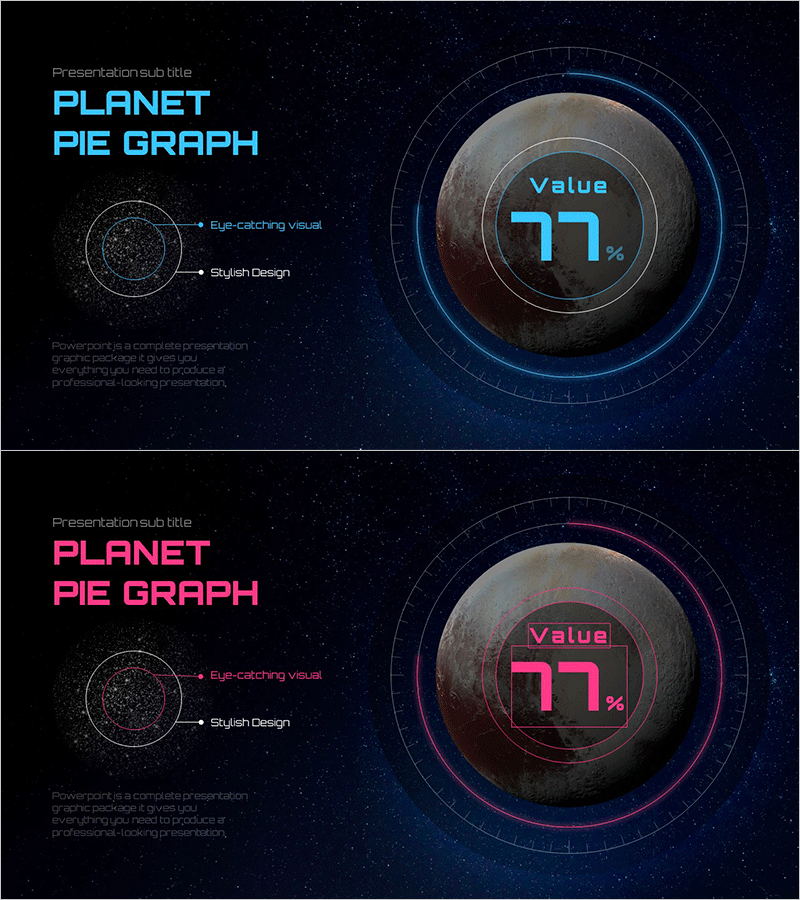
A distinctive pie chart PowerPoint slide inspired by planetary design and cosmic themes. Features a 3D planet sphere set against a deep space background with concentric ring structures to visualize numerical data. Provided in two color versions—cyan blue and magenta pink—each with a centered value display and outer scale rings for clear information hierarchy. The 2-slide deck in 16:9 PPTX format is ready for immediate use in corporate presentations, performance reports, and data analysis slides. The planet-based chart conveys percentage ratios intuitively while maximizing visual impact for your presentation.
Usage Points
-
Main Usage
Visualizes numerical data ratios and composition through a distinctive pie chart format. The planet sphere motif combined with concentric ring structure conveys both cosmic scale and professional credibility beyond simple numerical comparison. The centered value display emphasizes key metrics while outer scale rings provide precise data information.
-
How to Use
Use in corporate performance reports, marketing analysis presentations, investor pitch decks, and technical presentations to display key metrics such as achievement rates, market share, or growth percentages. The cyan version suits finance and technology presentations requiring trust and stability, while the magenta version works well for startups and marketing presentations emphasizing creativity and innovation.
-
Recommended For
Data analysts, marketing professionals, executives, investor relations managers, technology leaders, and consultants presenting data-driven insights. Particularly effective when highlighting single-metric achievement rates or proportions, and ideal for organizations needing a space-tech or future-oriented visual identity.
-
Slide Structure
2-slide composition presenting identical pie chart structure in two color variations—cyan blue and magenta pink. Each slide features a centered 3D planet sphere, three-tier concentric ring structure (data display area), centered value display field (example: Value 77%), and outer scale tick marks. Left side includes descriptive text area for context and annotations.
Related Products
-

Current Status of Energy Business Development – Pie Chart for Business Intro
#Product/Service Introduction #Business Introduction #Graph
-

Business Analysis Pie Chart
#Product/Service Introduction #Market and Competitor Analysis #Graph
-

Sugar Type Analysis Pie Chart
#Product/Service Introduction #Market and Competitor Analysis #Graph
-

Data Market Analysis Circle Chart – Insightful Visuals
#Product/Service Introduction #Market and Competitor Analysis #Graph
