Sugar Type Analysis Pie Chart
RJ0400034_17
- Last Update 05/26/2025
- File Size 1.6MB
- # of Slides 2
- File Format PPTX
- Slide Ratio 16:9
- Color
Keywords
About the Product
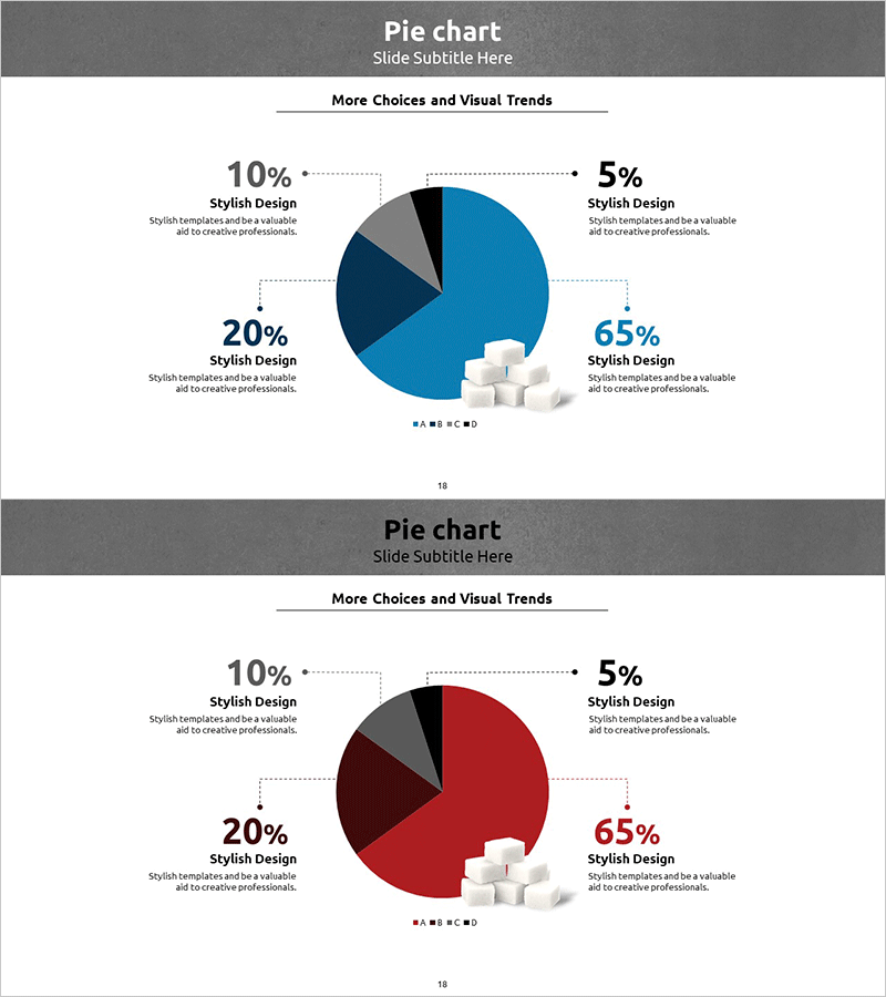
A PowerPoint pie chart slide that visualizes the proportion of four data segments using a dual-tone color scheme of blue and red tones. Each pie segment displays percentage values and corresponding labels, with a 3D cube icon positioned at the center for visual emphasis. Dotted connector lines clearly link each segment to its label, making data relationships immediately apparent. This pie chart slide is ideal for product introductions, market analysis presentations, ingredient breakdowns, and any scenario requiring clear visualization of compositional ratios in business, manufacturing, or sales contexts.
Usage Points
-
Main Usage
Visualize the composition of four data categories—such as product components, market share, ingredient distribution, or sales proportions—using a pie chart format that enables audiences to instantly grasp data distribution and relative percentages.
-
How to Use
Replace the percentage values in each pie segment with your actual data figures and update the segment labels to match your presentation topic. You can retain the existing dual-tone color scheme or customize the colors to align with your corporate brand identity.
-
Recommended For
Manufacturing professionals, food industry specialists, distribution managers, marketing executives, product planning teams, sales presenters, and market research analysts who need to communicate data-driven insights through visual ratio comparisons.
-
Slide Structure
A 2-slide set featuring a pie chart with four segments (blue 65%, dark blue 20%, gray 10%, red 5%), a central 3D cube icon for visual focus, dotted connector lines linking each segment to its label, and a title area at the top for slide identification.
Related Products
-

Business Analysis Pie Chart
#Product/Service Introduction #Market and Competitor Analysis #Graph
-

Space Industry Analysis Circular Graph
#Product/Service Introduction #Market and Competitor Analysis #Diagram
-

Data Market Analysis Circle Chart – Insightful Visuals
#Product/Service Introduction #Market and Competitor Analysis #Graph
-

Visualizing Genetic Research Data with a Donut Chart
#Product/Service Introduction #Market and Competitor Analysis #Diagram
