Modern Styled Table Chart for Data Visualization – Clarity and Precision
RJ0700024_19
- Last Update 07/28/2025
- File Size 3.1MB
- # of Slides 2
- File Format PPTX
- Slide Ratio 16:9
- Color
Keywords
About the Product
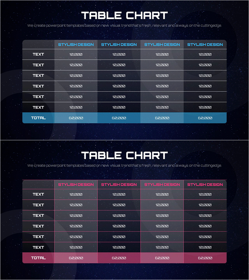
A 6-row by 4-column data table PowerPoint slide set designed for clear information hierarchy. Featuring a dark navy background with blue and pink header rows, each slide includes text input areas and numeric data cells with a highlighted total row in contrasting accent colors. Ideal for business reports, financial analysis, performance comparisons, and quantitative data presentations. Ready to use immediately in executive briefings, quarterly reviews, and stakeholder communications.
Usage Points
-
Main Usage
Present quantitative data and numerical information in a structured table format for clear comparison and analysis. The blue and pink header rows distinguish categories, while the highlighted total row emphasizes key metrics for immediate comprehension.
-
How to Use
Input text and numerical data into each cell to display departmental performance, monthly revenue, product sales volume, regional results, or other comparative metrics. Customize header and total row colors to match your presentation brand identity for visual consistency.
-
Recommended For
Finance teams presenting quarterly earnings reports, sales teams analyzing sales performance, marketing teams comparing campaign results, executives delivering business status updates, and investors reviewing company performance metrics.
-
Slide Structure
Two-slide set with blue header table and pink header table. Each table contains 6 rows (5 data rows plus 1 total row) and 4 columns (1 item column plus 3 data columns). Optimized for 16:9 widescreen format.
Related Products
-

Fashion Business Profit and Loss Table - Financial Performance and Strategy
#Financial Plans and Performance #Diagram #Income Statement
-

Premium Management Presentation Table – Efficient Financial Planning
#Financial Plans and Performance #Diagram #Income Statement
-

Leather Material Presentation Template Table Chart – Financial Performance Visualization
#Financial Plans and Performance #Diagram #Income Statement
-

Income Statement Table – Clearly Presenting Financial Plans and Performance
#Financial Plans and Performance #Diagram #Income Statement
