Visual Data Overview of Research Findings – Beginning of Innovation
RJ0700021_8
- Last Update 07/28/2025
- File Size 0.7MB
- # of Slides 2
- File Format PPTX
- Slide Ratio 16:9
- Color
Keywords
About the Product
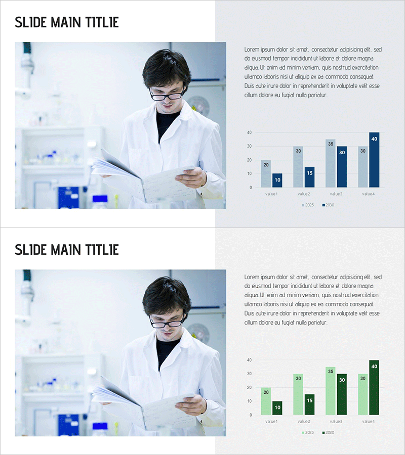
A grouped bar chart PowerPoint slide designed to visualize research findings and comparative data analysis. This presentation template displays four metrics across two years (2023 and 2024) in a side-by-side grouped format for intuitive year-over-year performance comparison. The layout combines a researcher image in a laboratory setting on the left with data visualization on the right, creating a professional composition ideal for academic presentations and research reports. The blue-toned chart palette emphasizes credibility and expertise, while the balanced arrangement of text and graph areas maintains audience focus. Fully editable PPTX format allows quick data input and customization for your specific metrics.
Usage Points
-
Main Usage
Effectively visualizes comparative data such as research outcomes, experimental results, and business performance metrics across multiple time periods and categories. Enhances credibility of quantitative findings and improves audience comprehension in academic presentations, research reports, and corporate performance reviews.
-
How to Use
Insert research imagery, experimental photos, or product visuals in the left image area. Input your actual data values into the right chart section. Replace legend labels (2023/2024) and axis labels (value1-4) with your specific category names. Color adjustments can be applied easily through PowerPoint's built-in formatting tools.
-
Recommended For
University research teams, science and medical field presenters, business performance report managers, data analysts, academic conference speakers, and corporate executives presenting quantitative results. Ideal for presentations requiring data-driven evidence and professional visualization.
-
Slide Structure
Two-slide set with each slide divided into left image area (approximately 40%) and right data visualization area (approximately 60%). The chart features a grouped bar format displaying 4 categories (value1-4) with 2 data series (2023 and 2024) arranged side-by-side, with value labels displayed above each bar.
Related Products
-

Comparative Analysis Vertical Bar Chart – Market and Competitor Analysis
#Market and Competitor Analysis #Graph #Competitor Analysis
-

Regional Competitive Advantage Chart – Essential Tool for Market and Competitor Analysis
#Company Introduction #Market and Competitor Analysis #Graph
-

Vertical Bar Chart Slide for Effective Data Visualization
#Market and Competitor Analysis #Graph #Competitor Analysis
-

User Analysis Bar Graph – Providing Customer Insights
#Market and Competitor Analysis #Graph #Customer Analysis
