Start of the Challenge Vertical Bar Graph – Market Analysis
RJ0500042_30
- Last Update 06/19/2025
- File Size 0.2MB
- # of Slides 2
- File Format PPTX
- Slide Ratio 16:9
- Color
Keywords
About the Product
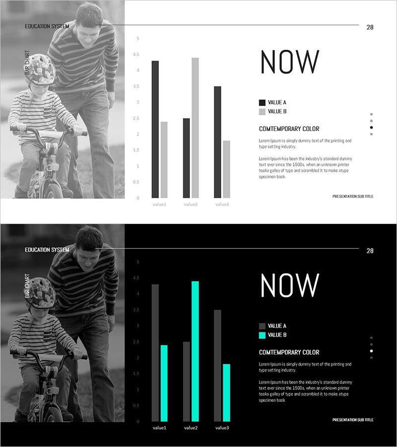
A vertical bar chart PowerPoint slide designed for market analysis and competitive benchmarking presentations. The clustered bar graph features two data series in black and gray, enabling clear comparison of three data points across categories. Optimized for education system presentations with a balanced layout combining a grayscale image on the left and data visualization on the right. Includes 2 slide variations with different color themes (light and dark), fully editable in PPTX format for immediate customization.
Usage Points
-
Main Usage
Visualize three-category numerical data such as market conditions, competitor benchmarks, sales trends, or customer satisfaction ratings using a clustered vertical bar chart. Serves as a core slide for data-driven presentations in educational and business contexts, supporting evidence-based decision-making.
-
How to Use
Double-click the chart area on the right to edit values directly, or open the chart data table to modify category names and numerical values. The left image section can be removed or replaced with your own photo. Legend labels, axis titles, and gridlines are fully customizable through PowerPoint's chart editing tools.
-
Recommended For
Marketing managers, sales directors, business analysts, educators, consultants, and executives preparing market reports, performance comparisons, and quarterly reviews. Particularly effective for B2B presentations requiring clear quantitative data visualization and professional appearance.
-
Slide Structure
Two-slide set featuring light theme (white background with black and gray bars) and dark theme (black background with cyan accent bars). Each slide divides the layout 50-50 between a grayscale photograph on the left and a data visualization area on the right. The clustered vertical bar chart displays three categories with two data series, scaled from 0 to 5 on the Y-axis.
Related Products
-

Touch Wide Slide Template – Column Chart & Table
#Market and Competitor Analysis #Diagram #Graph
-

Market Analysis and Status Graph Slide – Harmony of Green and Orange
#Market and Competitor Analysis #Graph #Market Status
-

Comparative Mixed Graph – Market and Competitor Analysis
#Market and Competitor Analysis #Graph #Market Status
-

Blue Green Vertical Bar Graph – A Powerful Tool for Market Analysis
#Market and Competitor Analysis #Graph #Competitor Analysis
