Vertical Bar Chart for Data Visualization – Top Quality Design
RJ0700021_35
- Last Update 07/28/2025
- File Size 1.2MB
- # of Slides 2
- File Format PPTX
- Slide Ratio 16:9
- Color
Keywords
About the Product
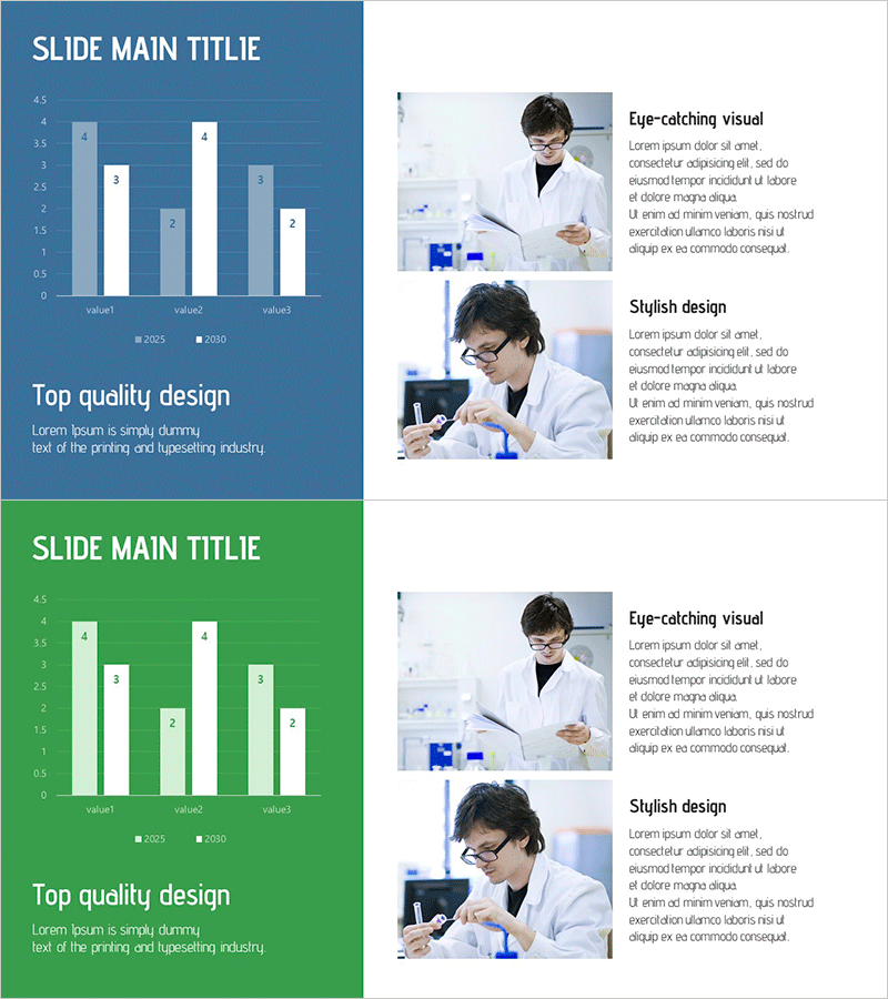
A professional vertical bar chart PowerPoint slide designed for comparing experimental data, sales performance, and key metrics across multiple categories. This 2-slide set features a steel blue background with white typography and light blue bars, displaying 3 items with dual-year data (2025 and 2030) side by side. Each slide includes a title area, legend, and axis labels, ready for immediate use in presentations. Simply update the numerical values to refresh the chart, making it ideal for scientific, medical, and business analytics presentations. The layout supports clear data visualization and audience comprehension of comparative trends.
Usage Points
-
Main Usage
Visualizes quantitative data comparisons across categories and time periods. Effectively communicates experimental results, sales figures, performance metrics, and market research data. Enables audiences to quickly grasp differences between data points and understand comparative trends at a glance.
-
How to Use
Insert into reports, proposals, and business plans within analysis or results sections. Replace the sample values and category labels with your own data, adjust year labels if needed, and use immediately in presentations. Compatible with both printed and digital presentation formats.
-
Recommended For
Ideal for researchers, data analysts, business planners, and marketers in science, healthcare, IT, and corporate sectors. Particularly suited for year-over-year comparisons, departmental performance analysis, product line sales comparisons, and multi-category quantitative reporting.
-
Slide Structure
2-slide set. Each slide features a title area at the top (SLIDE MAIN TITLE), a vertical bar chart on the left (3 items × 2 data series), and an image section on the right with scientist photos and descriptive text (Eye-catching visual, Stylish design). Bars are color-coded in light blue and dark blue, with legend and axis labels included.
Related Products
-

Visual Data Overview of Research Findings – Beginning of Innovation
#Market and Competitor Analysis #Graph #Market Analysis
-

Sales & Performance Status Slide – Data-Driven Insights
#Company Introduction #Market and Competitor Analysis #Diagram
-

Market Value Proof PowerPoint Slide – Line & Bar Chart Dark
#Business Strategy #Market and Competitor Analysis #Graph
-

Vertical Bar Chart for Future Growth Prediction – Innovative Vision
#Market and Competitor Analysis #Graph #Competitor Analysis
