Health Checkup Data Analysis Circular Graph – Effective Business Data Visualization
RJ0700016_6
- Last Update 07/26/2025
- File Size 0.4MB
- # of Slides 2
- File Format PPTX
- Slide Ratio 16:9
- Color
Keywords
- #Content-Based Slides
- #Design-Based Slides
- #Product/Service Introduction
- #Market and Competitor Analysis
- #Diagram
- #Graph
- #Composition
- #Market Analysis
- #Cluster
- #Circles
- #Closed Cluster Diagram
- #Doughnut Chart
- #16:9
- #donut pie chart PowerPoint
- #circular graph slide template
- #4-segment data visualization
- #business chart PowerPoint
- #ratio chart slide download
About the Product
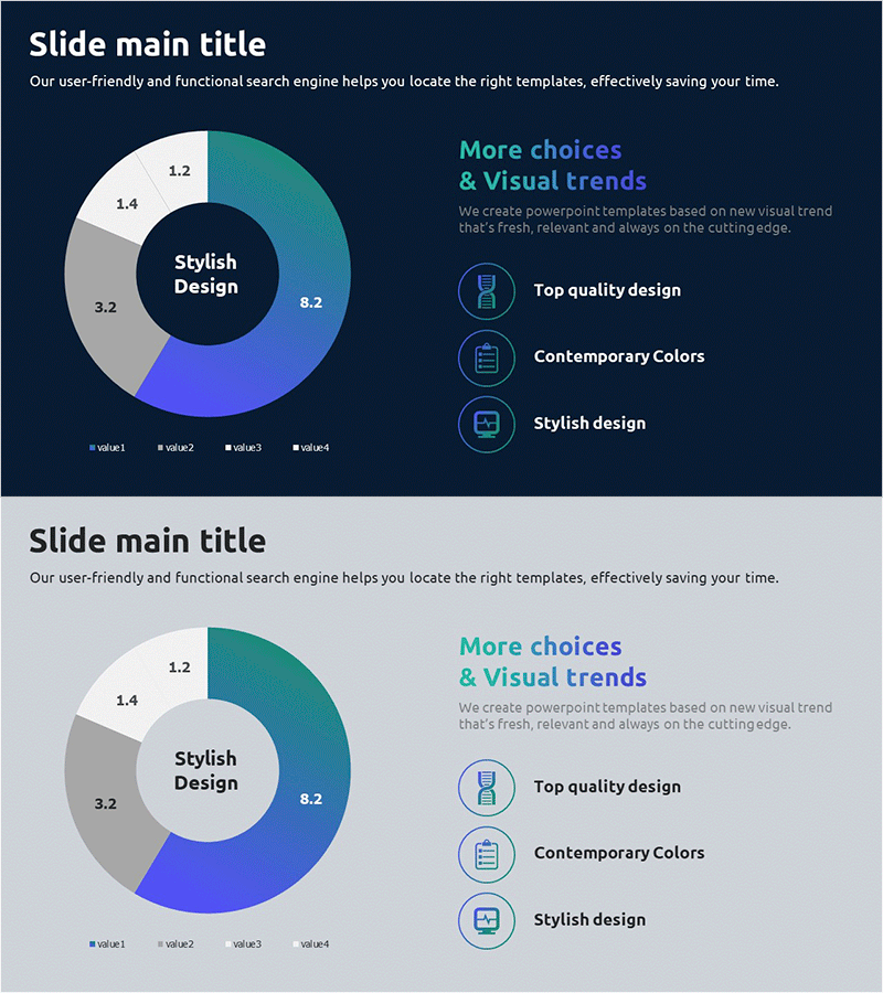
A professional donut pie chart PowerPoint slide featuring a 4-segment circular graph in teal, blue, and gray tones on a dark navy background. The center of the donut shape provides space for key messaging or core metrics, while the right side displays icon-based text descriptions for additional context. This 2-slide template is ideal for business data analysis, health checkup results, performance metrics, and market share presentations. All elements including shapes, colors, and text are fully editable for customization.
Usage Points
-
Main Usage
Visualize data proportions using a donut pie chart format. The center ring area highlights key metrics or core messages, while the four segments clearly show the composition ratio of each data category. Perfect for presenting health checkup results, market share distribution, budget allocation, customer satisfaction scores, and other quantitative business insights.
-
How to Use
Insert this slide in the analysis, results, or performance section of your presentation. Replace the segment labels and percentages with your actual data, and update the icon-based text descriptions on the right to provide supporting details or insights. The donut structure allows viewers to focus on both the overall metric and individual segment contributions simultaneously.
-
Recommended For
Data analysts, marketing professionals, executives, healthcare specialists, and project managers who need to present quantitative information. Particularly effective for reports, proposals, performance presentations, market analysis, and quarterly business reviews where proportion and composition are key messages.
-
Slide Structure
2-slide template with dark navy background. Each slide features a centered 4-segment donut pie chart (teal 8.2, blue, gray 3.2, white 1.4 proportions) with a legend at the bottom. The right side contains 3 icon-based text blocks arranged vertically for supplementary information. All elements are positioned for balanced visual hierarchy and easy data entry.
Related Products
-

Visualizing Genetic Research Data with a Donut Chart
#Product/Service Introduction #Market and Competitor Analysis #Diagram
-

Medical System Configuration Graph – Infographic for Market Analysis
#Product/Service Introduction #Market and Competitor Analysis #Diagram
-

Conveying Design Inspiration with Circular Diagram – Visually Appealing Presentation
#Product/Service Introduction #Market and Competitor Analysis #Graph
-

Donut Chart Comparing Market Share by Coffee Brand
#Market and Competitor Analysis #Diagram #Graph
