Circle Graph Visualization for Development Status
RJ0700014_7
- Last Update 07/26/2025
- File Size 0.4MB
- # of Slides 2
- File Format PPTX
- Slide Ratio 16:9
- Color
Keywords
- #Content-Based Slides
- #Design-Based Slides
- #Product/Service Introduction
- #Market and Competitor Analysis
- #Graph
- #Development Status
- #Market Share
- #Circles
- #Doughnut Chart
- #16:9
- #donut chart PowerPoint slide
- #circular chart template
- #ratio visualization PPT
- #donut graph presentation
- #market share chart slide
- #how to create donut chart in PowerPoint
About the Product
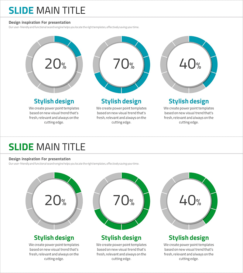
A donut chart PowerPoint slide template that visualizes development status, market share, and service composition with clarity and impact. Three donut charts in teal and gray tones display proportions of 20%, 70%, and 40% respectively, with central numeric areas and descriptive text fields below each chart. This structure enables effective data comparison and ratio communication in presentations. The 16:9 widescreen format includes 2 fully editable slides ready for immediate customization.
Usage Points
-
Main Usage
Visualize and compare development progress, market share percentages, and service composition ratios. The donut chart format allows central placement of key metrics or titles, creating strong emphasis on data points while maintaining visual balance.
-
How to Use
Edit percentage values and descriptive text below each donut chart to match your data. Customize teal accent colors, add or remove segments, and insert logos or additional information in the central circular area for brand alignment.
-
Recommended For
Marketing managers, business planners, development team leads, and financial analysts presenting project progress, market share analysis, budget allocation, and service composition breakdowns in reports and presentations.
-
Slide Structure
2-slide set featuring teal-accent donuts on slide 1 and green-accent donuts on slide 2. Each donut displays central percentage values (20%, 70%, 40%) with descriptive text areas positioned below, creating a consistent and professional layout.
Related Products
-

Business Idea Development Status Graph – Ideas and Growth
#Product/Service Introduction #Market and Competitor Analysis #Graph
-

Map Donut Graph for Visualizing Market Share – Symbol of Practicality and Change
#Product/Service Introduction #Market and Competitor Analysis #Graph
-

Sales Status Analysis Graph – Simple and Stylish Design
#Product/Service Introduction #Market and Competitor Analysis #Graph
-

Website Technology Development Status Graph – Market Share and Trends
#Product/Service Introduction #Market and Competitor Analysis #Graph
