Medical Record Analysis Bar Graph – Market and Competitor Analysis
RJ0700014_16
- Last Update 07/25/2025
- File Size 5.8MB
- # of Slides 2
- File Format PPTX
- Slide Ratio 16:9
- Color
Keywords
- #Content-Based Slides
- #Design-Based Slides
- #Market and Competitor Analysis
- #Graph
- #Competitor Analysis
- #Market Analysis
- #Horizontal Bar
- #Grouped Horizontal Bar
- #16:9
- #grouped bar chart PowerPoint
- #horizontal bar graph template
- #year-over-year comparison slide
- #market analysis chart
- #competitor analysis PowerPoint
- #data visualization slide
About the Product
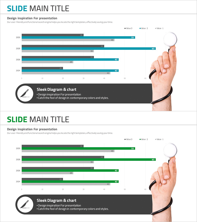
A grouped horizontal bar chart PowerPoint slide optimized for medical data analysis and competitive market comparison. This presentation template displays four data series across years 2024 to 2030 in a side-by-side layout, enabling instant visual comparison of trends and performance metrics. Ideal for healthcare analytics, market size tracking, and competitor benchmarking presentations. The teal and gray color scheme creates clear visual hierarchy, with numeric labels prominently displayed for precise data communication. The 16:9 widescreen format spans 2 slides, integrating seamlessly into your presentation flow.
Usage Points
-
Main Usage
Compare multi-series data such as medical records, market size, and competitor performance across multiple years. The grouped layout allows simultaneous visualization of differences between items and trends over time, making complex data relationships immediately clear to your audience.
-
How to Use
Replace the numeric labels with your actual data values. Modify the bar lengths and numbers to reflect your analysis results, update the legend and title to match your presentation context, and adjust colors using PowerPoint's shape formatting tools if needed.
-
Recommended For
Healthcare and pharmaceutical executive reports, market research presentations, competitive benchmarking analysis, business performance comparisons, financial analysis materials, and consulting proposals. Particularly effective for data-driven decision-making presentations in B2B environments.
-
Slide Structure
Two-slide set with the first slide emphasizing teal color series and the second highlighting green color series. Each slide displays 4 years (2024–2030) on the horizontal axis and 3 values (Value 1, 2, 3) as data series. Numeric labels appear at the end of each bar for precise value communication.
Related Products
-

Horizontal Bar Chart for Financial Business Market Analysis
#Market and Competitor Analysis #Graph #Competitor Analysis
-

Comparative Analysis Bar Graph – Data-Driven Market Insights
#Market and Competitor Analysis #Graph #Competitor Analysis
-

Cybersecurity Business Market Analysis Graph
#Market and Competitor Analysis #Graph #Competitor Analysis
-

Mobile Market Analysis Graph – Insights on Market Trends
#Market and Competitor Analysis #Diagram #Graph
