



Medical Research Data Bar Graph – Reliable Analysis
RJ0700012_22
- Last Update 07/25/2025
- File Size 1MB
- # of Slides 2
- File Format PPTX
- Slide Ratio 16:9
- Color
Keywords
About the Product
A horizontal bar graph PowerPoint slide designed for medical research data visualization. This presentation template compares reliability metrics across four years (2025, 2023, 2025, 2024) with clear numerical labels on each bar. The consistent dark blue color palette reinforces medical credibility and professional authority, while the 0-100% percentage axis enables intuitive data comparison. Ideal for clinical research presentations, medical reports, healthcare data analysis, and institutional research briefings. Ready to download and customize with your own medical datasets.
Usage Points
-
Main Usage
Visualize year-over-year medical research metrics and reliability indicators using a horizontal bar graph format. The 4-year comparison structure allows healthcare professionals to identify trends and performance variations at a glance, while the dark blue color scheme conveys medical authority and trustworthiness.
-
How to Use
Deploy in clinical research presentations, pharmaceutical company briefings, hospital performance reviews, and medical data analysis sessions. Ideal for explaining research outcomes, clinical trial results, and healthcare statistics. Simply replace the data values and year labels with your own metrics to create a customized analysis slide.
-
Recommended For
Medical researchers, clinical physicians, healthcare statisticians, pharmaceutical marketing teams, hospital administrators, and medical consultants presenting data-driven insights. Perfect for any healthcare presentation requiring comparative analysis of reliability, accuracy, efficacy, or performance metrics.
-
Slide Structure
Two-slide layout with title and descriptive text on the first slide, followed by a horizontal bar graph on the second slide. Four bars represent years 2025, 2023, 2025, and 2024 with percentage values (ranging 0-100%) clearly labeled at bar endpoints. 16:9 widescreen format optimized for modern presentation environments and digital displays.
Related Products
-
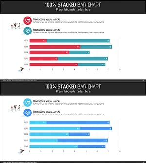
Market Analysis with Horizontal Stacked Bar Graph – Visualizing Competitive Advantage
#Market and Competitor Analysis #Graph #Competitor Analysis
-
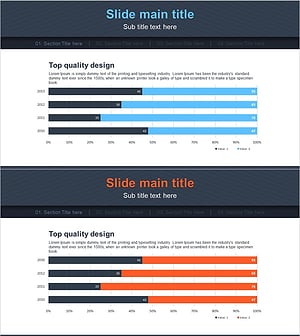
Blue Orange Segmentation Graph – Market and Competitor Analysis
#Market and Competitor Analysis #Graph #Competitor Analysis
-
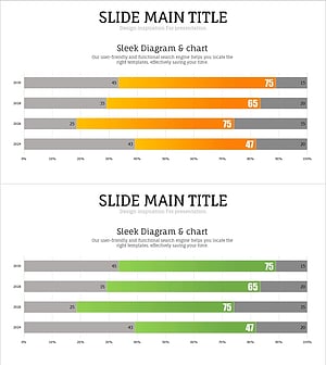
Detailed Emphasis Bar Graph for Market and Competitor Analysis
#Market and Competitor Analysis #Graph #Competitor Analysis
-
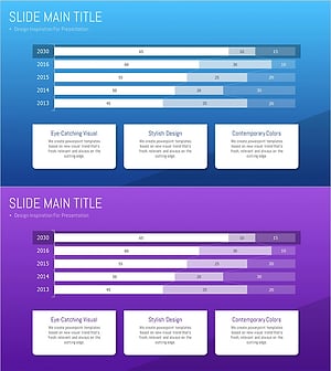
Analysis of the Bar Graph by Year – Competitive Edge Insights
#Market and Competitor Analysis #Graph #Competitor Analysis