Aerospace Industry Development Status Graph
RJ0700003_30
- Last Update 07/22/2025
- File Size 0.4MB
- # of Slides 2
- File Format PPTX
- Slide Ratio 16:9
- Color
Keywords
- #Content-Based Slides
- #Design-Based Slides
- #Product/Service Introduction
- #Market and Competitor Analysis
- #Graph
- #Development Status
- #Market Share
- #Circles
- #Doughnut Chart
- #16:9
- #doughnut chart PowerPoint slide
- #pie chart template aerospace
- #3-segment ratio chart
- #industry development status presentation
- #circular graph slide design
About the Product
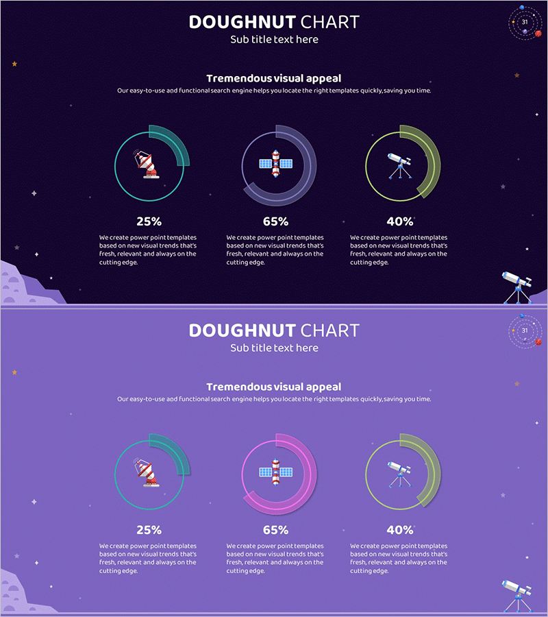
A doughnut chart PowerPoint slide comparing three key segments of aerospace industry development status. Set against a deep purple background, three circular charts feature cyan, purple, and yellow gradient rings that intuitively display proportional data for each category. Satellite, construction, and telescope icons visually emphasize major aerospace sectors, with two slide variations providing a lighter purple background option. Fully editable for immediate use in market analysis presentations, business reports, and industry status updates.
Usage Points
-
Main Usage
Optimized for comparing and analyzing aerospace industry development status, market share, and sector distribution across three key segments using doughnut chart visualization. Satellite, construction, and telescope icons symbolically represent core aerospace sectors while presenting numerical data through intuitive circular proportions.
-
How to Use
Use in investor presentations, business reports, and market analysis briefings to display industry segment distribution, growth rates, and market share. Easily customize chart colors, percentages, and labels for various industries and datasets. Switch between two background color versions to adjust presentation tone and visual hierarchy.
-
Recommended For
Ideal for aerospace, defense, and space technology company executives, marketing teams, and strategic planning departments presenting business status and market analysis. Also suitable for consulting firms, research institutions, and government agencies preparing industry analysis materials and competitive landscape reports.
-
Slide Structure
Two-slide set, each featuring three doughnut charts arranged horizontally. First slide uses deep purple background; second slide provides lighter purple variant. Each doughnut chart displays cyan, purple, and yellow gradient borders for segment differentiation, with satellite, construction, and telescope icons centered to identify data categories visually.
Related Products
-

Financial Business Analysis Pie Chart – Market Share Insights
#Product/Service Introduction #Market and Competitor Analysis #Graph
-

City Theme Market Share Graph – Business Data Visualization
#Product/Service Introduction #Market and Competitor Analysis #Graph
-

Analysis graph of market share progress
#Product/Service Introduction #Market and Competitor Analysis #Graph
-

Business Idea Development Status Graph – Ideas and Growth
#Product/Service Introduction #Market and Competitor Analysis #Graph
