Map Donut Graph for Visualizing Market Share – Symbol of Practicality and Change
RJ0300076_27
- Last Update 05/10/2025
- File Size 1.3MB
- # of Slides 2
- File Format PPTX
- Slide Ratio 16:9
- Color
Keywords
- #Content-Based Slides
- #Design-Based Slides
- #Product/Service Introduction
- #Market and Competitor Analysis
- #Graph
- #Development Status
- #Market Share
- #Circles
- #Doughnut Chart
- #16:9
- #donut chart PowerPoint
- #pie chart slide template
- #market share visualization
- #percentage comparison presentation
- #how to create donut chart in PowerPoint
About the Product
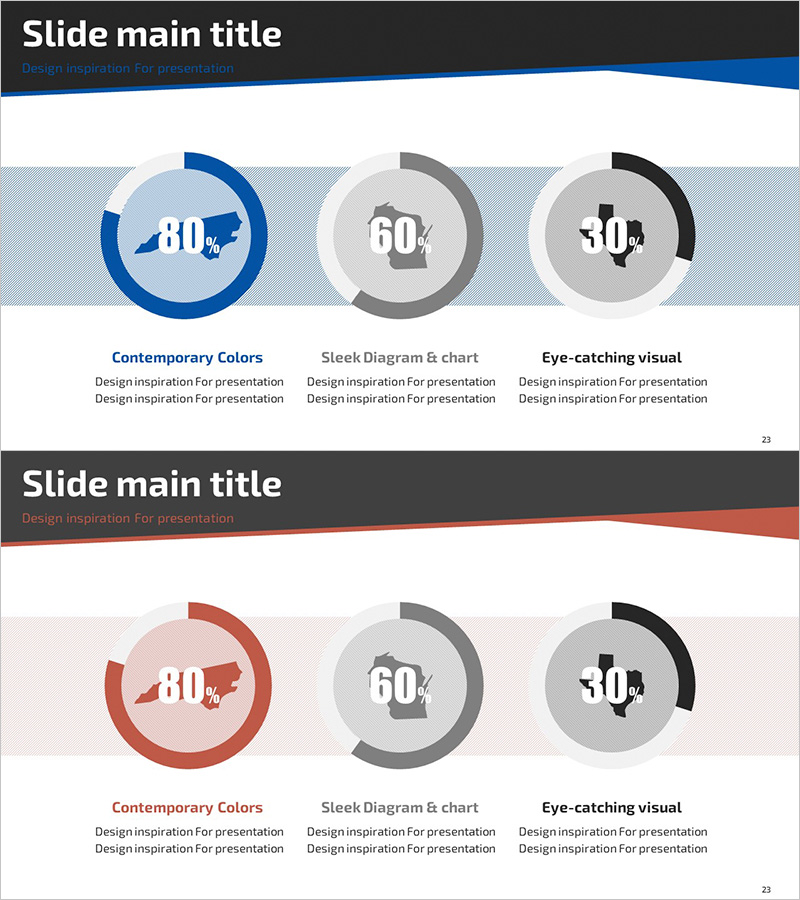
A 2-slide PowerPoint presentation combining map backgrounds with donut charts for data visualization. Three color variations—blue, gray, and black—enable clear comparison of market share, sales ratios, and customer distribution at a glance. Each donut chart displays percentage data with precision, while the map background supports regional market analysis. In 16:9 widescreen PPTX format, fully editable and ready for business presentations, marketing plans, and financial reports.
Usage Points
-
Main Usage
Visualize ratio data such as market share, sales performance, and customer segments using donut charts. Combined with map backgrounds, it effectively presents regional and departmental comparisons for executive reports, investor pitches, and marketing strategy presentations.
-
How to Use
Open the slide and replace the percentage values in each donut chart with your actual data. Colors are fully customizable to match your brand identity, and map elements can be adjusted or removed as needed. Ready to use directly in business presentations, quarterly reports, and market analysis materials.
-
Recommended For
Ideal for marketing managers, sales directors, financial analysts, and executives preparing reports. Suitable for market research, sales performance analysis, customer segmentation, and regional performance comparisons.
-
Slide Structure
Two-slide layout with three donut charts per slide. Each chart in blue, gray, and black represents independent data series, while light gray striped backgrounds and map elements provide visual cohesion and context.
Related Products
-

Stock Market Share Analysis Graph – Insights and Strategies
#Product/Service Introduction #Market and Competitor Analysis #Graph
-

Mobile App Market Share Analysis Graph
#Product/Service Introduction #Market and Competitor Analysis #Diagram
-

Analysis graph of market share progress
#Product/Service Introduction #Market and Competitor Analysis #Graph
-

City Theme Market Share Graph – Business Data Visualization
#Product/Service Introduction #Market and Competitor Analysis #Graph
