Solar System Illustration Timeline Diagram – Visual Data Analysis
RJ0700003_26
- Last Update 07/22/2025
- File Size 0.5MB
- # of Slides 2
- File Format PPTX
- Slide Ratio 16:9
- Color
Keywords
- #Content-Based Slides
- #Design-Based Slides
- #Product/Service Introduction
- #Market and Competitor Analysis
- #Graph
- #Development Status
- #Market Share
- #Circles
- #Doughnut Chart
- #16:9
- #doughnut chart PowerPoint
- #pie chart slide template
- #ratio data visualization
- #donut graph presentation
- #percentage chart PowerPoint slide
About the Product
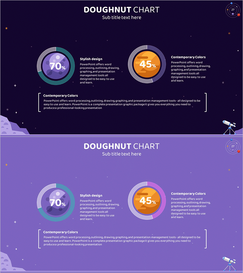
Universe-themed doughnut chart PowerPoint slide set featuring two data visualization slides. The slides display 70% and 45% proportions using gradient doughnut graphs in purple, orange, and teal colors to represent market share, composition ratios, performance metrics, and other key indicators. Optimized for 16:9 widescreen format in editable PPTX, with space-themed illustrations including stars, planets, and telescope elements that enhance visual appeal. Ideal for business reports, marketing presentations, performance analysis, and quarterly reviews.
Usage Points
-
Main Usage
Designed to simultaneously display two major metrics such as market share, sales composition, achievement rate, or budget allocation. The doughnut chart's central circle emphasizes percentage values, allowing audiences to grasp data insights at a glance.
-
How to Use
Double-click the doughnut chart percentages (70%, 45%) on each slide to replace with your actual data. The unified color palette of purple, orange, and teal can be adjusted to match your brand colors. Add analysis content to the text description areas to complete your presentation.
-
Recommended For
Finance teams presenting budget status reports, marketing teams analyzing channel performance, sales teams presenting goal achievement rates, executives delivering quarterly performance reviews, and investor presentations. Particularly effective when comparing two key performance indicators.
-
Slide Structure
Two-slide composition with one doughnut chart per slide. Left slide features a 70% purple-teal gradient doughnut chart, right slide displays a 45% orange-gray doughnut chart. Each chart is accompanied by descriptive text areas labeled 'Stylish design' and 'Contemporary Colors' for additional context.
Related Products
-

Website Technology Development Status Graph – Market Share and Trends
#Product/Service Introduction #Market and Competitor Analysis #Graph
-

City Theme Market Share Graph – Business Data Visualization
#Product/Service Introduction #Market and Competitor Analysis #Graph
-

Financial Business Analysis Pie Chart – Market Share Insights
#Product/Service Introduction #Market and Competitor Analysis #Graph
-

Graph of Analysis of Transportation Development Status
#Product/Service Introduction #Market and Competitor Analysis #Graph
