Holiday vs Break Time Analysis Doughnut Chart
RJ0300031_17
- Last Update 04/26/2025
- File Size 0.7MB
- # of Slides 2
- File Format PPTX
- Slide Ratio 16:9
- Color
Keywords
- #Content-Based Slides
- #Design-Based Slides
- #Product/Service Introduction
- #Market and Competitor Analysis
- #Graph
- #Development Status
- #Market Share
- #Circles
- #Doughnut Chart
- #16:9
- #doughnut chart PowerPoint
- #pie chart slide template
- #ratio comparison presentation
- #data visualization slides
- #HR analytics PPT
- #holiday analysis template
About the Product
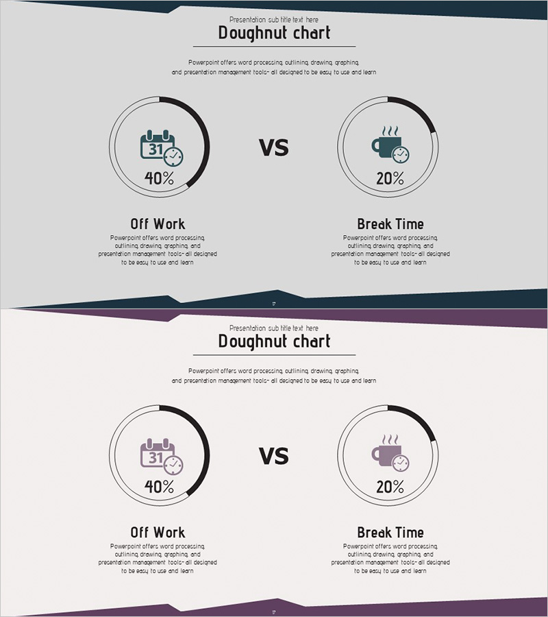
A PowerPoint slide deck featuring doughnut charts comparing holiday and break time ratios with visual clarity. The 2-slide presentation includes a dark blue header and purple wave design elements, with two doughnut charts positioned symmetrically on each slide. Icons and percentage labels (40%, 20%) make data comparison intuitive and immediate. Perfect for HR reports, workplace environment analysis, employee benefits presentations, and organizational policy communications that require quick-to-use presentation materials.
Usage Points
-
Main Usage
Visualize organizational holiday policies and break time allocation through numerical comparison. The doughnut chart design places icons in the center space to convey meaning intuitively, while the symmetrical left-right layout maximizes the contrast effect between two datasets.
-
How to Use
Deploy in HR department reports on workplace environment improvements, employee benefits presentations, and organizational culture analysis. Double-click percentage values and labels to instantly update with your own data without design disruption.
-
Recommended For
HR professionals, organizational development specialists, executive report presenters, and employee satisfaction survey coordinators presenting workplace improvement initiatives. Also suitable for educational institutions analyzing student break schedules and public sector agencies explaining leave policies.
-
Slide Structure
Two-slide layout with two doughnut charts per slide arranged symmetrically. Left chart displays 40% ratio, right chart shows 20% ratio, each with centered icons (calendar and coffee cup). Dark blue header and purple wave dividers maintain visual consistency across slides.
Related Products
-

Stock Market Share Analysis Graph – Insights and Strategies
#Product/Service Introduction #Market and Competitor Analysis #Graph
-

Development Status Analysis Donut Chart – Market Share Visualization
#Product/Service Introduction #Market and Competitor Analysis #Graph
-

City Theme Market Share Graph – Business Data Visualization
#Product/Service Introduction #Market and Competitor Analysis #Graph
-

Financial Business Analysis Pie Chart – Market Share Insights
#Product/Service Introduction #Market and Competitor Analysis #Graph
