Big Data Technology Analysis Graph – Market Share Visualization
RJ0400053_22
- Last Update 06/01/2025
- File Size 1.3MB
- # of Slides 2
- File Format PPTX
- Slide Ratio 16:9
- Color
Keywords
- #Content-Based Slides
- #Design-Based Slides
- #Product/Service Introduction
- #Market and Competitor Analysis
- #Diagram
- #Graph
- #Development Status
- #Market Share
- #Circles
- #Doughnut Chart
- #16:9
- #doughnut chart PowerPoint slide
- #pie chart template
- #market share visualization
- #data ratio PPT
- #how to create doughnut chart in PowerPoint
About the Product
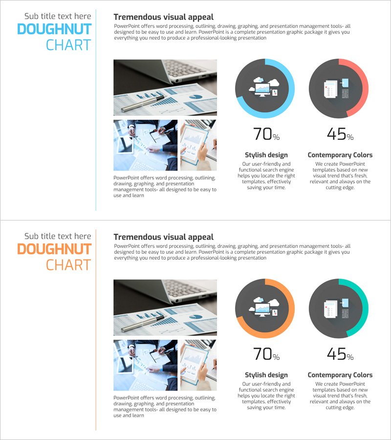
A professional doughnut chart PowerPoint slide designed to visualize market share and data ratios with clarity and impact. This 2-slide template uses contrasting color schemes—blue, orange, and teal—to distinguish each segment effectively. Perfect for technology analysis presentations, big data reports, and market research summaries where proportional data needs to stand out. The 16:9 widescreen format ensures compatibility with modern presentation environments, and all text and numerical values are fully editable for your specific data.
Usage Points
-
Main Usage
Display and compare two or more data ratios such as market share, sales distribution, or customer segments simultaneously. The doughnut structure allows you to place key metrics or titles in the center for emphasis, making it ideal for technology analysis, big data presentations, and executive reports that require quantitative visual evidence.
-
How to Use
Edit the numerical values and legend labels in each doughnut chart segment to match your dataset. Maintain the existing blue, orange, and teal color palette or customize it to align with your company's brand colors. Insert the slides into your presentation's market analysis, technology overview, or competitive comparison sections to enhance audience comprehension.
-
Recommended For
Data analysts, marketing professionals, technology strategists, and executives preparing quarterly performance reports and investor presentations. Ideal for IT companies, consulting firms, and financial institutions presenting market research findings, technology stack distributions, and customer demographic breakdowns.
-
Slide Structure
Two-slide template with one doughnut chart per slide. Each doughnut is divided into 2 segments using contrasting colors—blue, orange, and teal. Numerical percentages (70%, 45%, etc.) and legend text are positioned to the right of each chart for easy data interpretation and reference.
Related Products
-

Market Share Analysis by Sector Pie Chart
#Product/Service Introduction #Market and Competitor Analysis #Diagram
-

Market Share Pie Chart – Effective Market Analysis
#Product/Service Introduction #Market and Competitor Analysis #Diagram
-

Aviation Service Development Schedule Donut Circle Graph
#Product/Service Introduction #Market and Competitor Analysis #Diagram
-

Development Status Donut Graph – Market Share Visualization
#Product/Service Introduction #Market and Competitor Analysis #Diagram
