Astronomy Analysis Pie & Bar Chart – Data Visualization for Market Analysis
RJ0700003_13
- Last Update 07/22/2025
- File Size 0.4MB
- # of Slides 2
- File Format PPTX
- Slide Ratio 16:9
- Color
Keywords
- #Content-Based Slides
- #Design-Based Slides
- #Market and Competitor Analysis
- #Graph
- #Market Analysis
- #Horizontal Bar
- #Circles
- #Segmented Horizontal Bar
- #Pie Chart
- #16:9
- #pie chart PowerPoint slide
- #horizontal bar graph presentation
- #data visualization slides
- #market analysis chart
- #ratio comparison template
About the Product
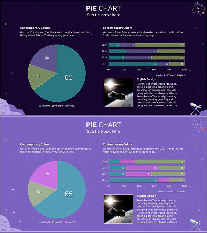
A 2-slide PowerPoint presentation set designed for astronomy analysis and market research data visualization. The first slide features a 3-segment pie chart (65·20·15 composition) as the focal point, while the second slide includes a 4-year horizontal bar graph in 100% stacked format showing trend analysis. The contemporary color palette—dark purple, teal, and lime—combined with space-themed background elements (stars and planet icons) adds professional credibility to your presentation. Both slides provide dedicated text areas and image insertion spaces for immediate customization and deployment.
Usage Points
-
Main Usage
This slide set simultaneously expresses proportional data comparison and time-series trend analysis. The pie chart clarifies overall composition ratios while the horizontal bar graph visualizes year-over-year and category-level changes, making it ideal for market analysis, sales performance reports, and research data presentations.
-
How to Use
On the first slide, replace the pie chart values (65·20·15) with your own data and edit the legend text accordingly. On the second slide, input your data for years (2021–2024) and three data series (Value 1·2·3) into the horizontal bar graph. Add relevant photos or explanatory text to the image area on the right side to complete the customization.
-
Recommended For
Marketing professionals, data analysts, financial reporting managers, academic presenters, and consultants who need to communicate quantitative insights. Particularly effective for quarterly and annual performance comparisons, customer segmentation analysis, market share analysis, and other multi-layered data representation scenarios.
-
Slide Structure
Slide 1: 3-segment pie chart (center-aligned, 65·20·15 ratio) + left text area (Contemporary Colors description) + right image insertion space. Slide 2: 4-row horizontal bar graph (2021–2024 years, 3 data series, 100% stacked format) + left text area + right image space. Both slides feature dark purple background with decorative star and planet elements.
Related Products
-

Market Entry Potential and Expansion Strategy Chart
#Market and Competitor Analysis #Graph #Market Status
-

Comparative Analysis Graph – Optimal Tool for Market and Competitor Analysis
#Market and Competitor Analysis #Graph #Competitor Analysis
-

Chemical Experiment Analysis Graph Chart – Visualizing R&D Achievements
#Technical Approach #Market and Competitor Analysis #Diagram
-

Manufacturing Analysis Graph – Market and Competitive Analysis
#Product/Service Introduction #Market and Competitor Analysis #Graph
