Space Industry Analysis Graph Chart – Market and Competitive Analysis
RJ0700002_28
- Last Update 07/21/2025
- File Size 0.5MB
- # of Slides 2
- File Format PPTX
- Slide Ratio 16:9
- Color
Keywords
- #Content-Based Slides
- #Design-Based Slides
- #Market and Competitor Analysis
- #Graph
- #Customer Analysis
- #Market Analysis
- #Horizontal Bar
- #Circles
- #Horizontal Bar Chart
- #Pie Chart
- #16:9
- #pie chart PowerPoint slide
- #circular graph presentation
- #market analysis chart
- #space industry analysis
- #competitive analysis graph
- #ratio visualization slide
About the Product
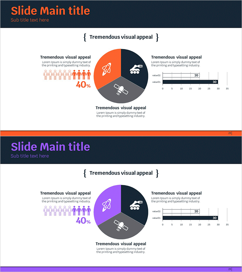
A PowerPoint slide featuring a three-segment pie chart designed for space industry market analysis and competitive comparison. The slide combines a circular graph in orange, purple, and gray colors against a dark navy background, with rocket, satellite, and people icons highlighting each segment's significance. A horizontal bar chart on the right displays numerical data, while the left side provides space for descriptive text. This 2-slide set enables immediate application to various industry analysis presentations and market research reports.
Usage Points
-
Main Usage
Visualize market share, industry proportion, and customer composition ratios using a pie chart, while simultaneously comparing numerical data with a horizontal bar graph for dual-layer data analysis.
-
How to Use
Use in aerospace, satellite communications, space exploration, and space industry presentations to explain market size, competitor market share, and customer segmentation. Input analysis content in the left text area and edit chart data on the right for immediate deployment.
-
Recommended For
Executives, investors, consultants, marketing professionals, and business development managers preparing industry analysis, market research, competitive analysis, and investment proposal materials. Particularly suitable for space industry, advanced technology, and emerging sector business presentations.
-
Slide Structure
Both slides 1 and 2 share identical layout: title area at top (dark navy background with orange text), 3-segment pie chart in center (orange 40%, purple 30%, gray 30%), left side with rocket, satellite, and people icons plus descriptive text area, right side with horizontal bar graph (2 series, 0-35 range).
Related Products
-

Chart of Industry Change and Global Market Outlook Analysis
#Market and Competitor Analysis #Graph #Market Analysis
-

Graphic Survey & Feedback Analysis – Visualizing Customer Insights
#Market and Competitor Analysis #Customer Success Stories #Graph
-

User Gender Ratio Analysis – Market Insights
#Market and Competitor Analysis #Graph #Customer Analysis
-

Customer and Market Analysis Slide – Yellow and Bluegreen Emotion
#Market and Competitor Analysis #Graph #Other
