Orange Purple Double Bar Graph – Market Analysis Tool
RJ0700002_25
- Last Update 07/21/2025
- File Size 0.3MB
- # of Slides 2
- File Format PPTX
- Slide Ratio 16:9
- Color
Keywords
- #Content-Based Slides
- #Design-Based Slides
- #Market and Competitor Analysis
- #Graph
- #Competitor Analysis
- #Horizontal Bar
- #Double Horizontal Bar
- #16:9
- #double bar graph PowerPoint
- #horizontal bar chart template
- #comparison analysis slide
- #market analysis presentation
- #data visualization PowerPoint template
About the Product
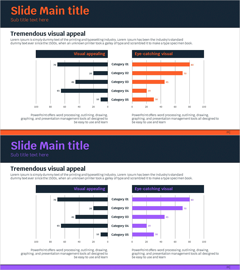
A dual-axis horizontal bar chart PowerPoint slide optimized for market analysis and competitive comparison. The design features orange and purple bar series positioned symmetrically left and right, enabling intuitive side-by-side comparison of metrics across five categories (Category 01 through 05). This structure is ideal for visualizing market share, revenue benchmarking, customer satisfaction scores, and performance metrics. The 2-slide template is formatted in 16:9 widescreen ratio and fully editable in PowerPoint. Simply double-click to modify values and category labels, making it ready for immediate presentation use.
Usage Points
-
Main Usage
Visualize two metrics across multiple categories using a symmetrical dual-bar structure. Ideal for comparing market share, competitive performance, customer satisfaction ratings, and revenue trends. The left-right layout makes differences immediately apparent and facilitates data-driven decision discussions.
-
How to Use
Insert into business plans, market analysis reports, quarterly performance reviews, and marketing strategy presentations. Edit the numeric values and category names directly in PowerPoint by double-clicking the text fields. The chart automatically adjusts proportions as you update data.
-
Recommended For
Executives, marketing managers, business development teams, consultants, and analysts presenting quantitative comparisons. Particularly effective for competitor benchmarking, period-over-period performance analysis, and A/B test result visualization.
-
Slide Structure
2-slide set. Each slide displays 5 categories with a symmetrical dual-bar layout: dark navy bars on the left (Visual appealing) and orange-purple bars on the right (Eye-catching visual). Numeric labels appear at the end of each bar for precise value reading and comparison.
Related Products
-

World Travel Two-Way Bar Graph
#Market and Competitor Analysis #Graph #Competitor Analysis
-

Competitor Analysis and Competitive Advantage – Red, Blue, Purple Bar Chart
#Market and Competitor Analysis #Graph #Competitor Analysis
-

Competitor Comparison Analysis Graph
#Market and Competitor Analysis #Graph #Competitor Analysis
-

Competitor Analysis Bar Graph – Check Market Advantage
#Market and Competitor Analysis #Graph #Competitor Analysis
