Surgical Site Analysis Graph – Market and Competitive Analysis
RJ0700005_15
- Last Update 07/22/2025
- File Size 0.3MB
- # of Slides 2
- File Format PPTX
- Slide Ratio 16:9
- Color
Keywords
About the Product
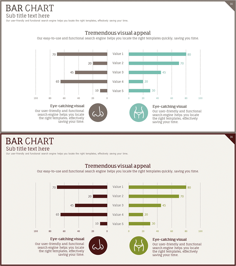
A dual bar chart PowerPoint slide with symmetrical left-right data comparison. The brown and teal two-tone color scheme creates clear contrast between two data series. Five items (Value 1–5) are positioned on the left and right sides, making it ideal for market analysis, competitive benchmarking, and comparative metrics. Dotted gridlines and labeled axes enhance data readability, while circular icon elements add visual emphasis. This 2-slide presentation is ready to edit and customize for your business needs.
Usage Points
-
Main Usage
This slide compares two data groups side-by-side using a symmetrical dual bar layout. Perfect for market share comparisons, competitor performance analysis, regional metrics, and positive-negative evaluations. The distinct brown and teal color coding instantly differentiates the two data series for clear visual communication.
-
How to Use
Insert this slide into business plans, marketing proposals, and market analysis reports in the competitive analysis section. Edit the bar values on both sides to input your data, and customize the item labels (Value 1–5) as needed. Add icons and descriptive text to align with your presentation context.
-
Recommended For
Marketing managers, strategy planners, sales directors, consultants, and business analysts. Ideal for market share comparisons, product performance benchmarking, customer satisfaction surveys, departmental performance reviews, and quantitative comparative analysis presentations.
-
Slide Structure
2-slide set. Each slide features a dual bar chart centered on the slide with 5 items. Left side displays brown bars, right side displays teal bars, creating a mirror-image comparison. Horizontal axis ranges from 0–100 with dotted gridlines for easy value reading. Vertical axis shows item labels. Circular icons and text areas at bottom-left and bottom-right allow for additional context or legend information.
Related Products
-

Astronomy Themed Bilinear Bar Graph – Market and Competitor Analysis
#Market and Competitor Analysis #Graph #Competitor Analysis
-

Performance Competitive Comparison Analysis Chart – Business Performance Analysis
#Company Introduction #Market and Competitor Analysis #Diagram
-

Competitor Comparison Analysis Graph
#Market and Competitor Analysis #Graph #Competitor Analysis
-

Competitor Paired Bar Graph – Market Analysis and Comparison
#Market and Competitor Analysis #Graph #Competitor Analysis
