Orange Purple Subdivided Graph Table – Visualizing Market Data
RJ0700002_22
- Last Update 07/21/2025
- File Size 0.3MB
- # of Slides 2
- File Format PPTX
- Slide Ratio 16:9
- Color
Keywords
- #Content-Based Slides
- #Design-Based Slides
- #Market and Competitor Analysis
- #Diagram
- #Graph
- #Market Analysis
- #Table
- #Column
- #Standard Table
- #Segmented Column
- #16:9
- #subdivided column chart PowerPoint
- #stacked bar graph template
- #market data visualization slide
- #multi-series chart
- #year-over-year comparison
- #data analysis presentation template
About the Product
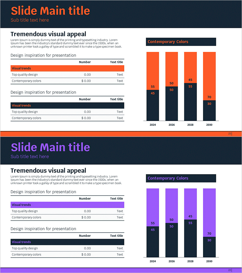
A subdivided column chart PowerPoint slide designed to visualize market data and year-over-year trends with clarity and impact. The dual-color scheme of orange and purple distinctly separates two data series, enabling direct comparison across four years (2024–2030) at a glance. The left-side table area accepts your custom data inputs, which automatically populate the right-side chart for immediate use. This presentation template is ideal for market reports, business proposals, and strategic presentations where multi-series numerical data—such as market size, sales volume, growth rates, or revenue streams—needs to be communicated effectively to stakeholders.
Usage Points
-
Main Usage
This slide compares multiple data series across years and categories using subdivided columns. It simultaneously displays two or more numerical metrics—such as market size, sales performance, growth rates, or market share—enabling intuitive visualization of trends and relative comparisons.
-
How to Use
Enter year-by-year and category-specific figures in the left-side table; the right-side chart updates automatically. Orange and purple colors distinguish the two data series, while numeric labels above each bar segment display exact values. During presentations, displaying both table and chart together reinforces numerical credibility while maximizing visual impact.
-
Recommended For
Marketing, sales, and finance professionals presenting market analysis, sales results, and financial performance. Ideal for business plans, quarterly reports, investor presentations, and strategic planning decks where competitive benchmarking, market share evolution, or product-line growth rates require persuasive visualization.
-
Slide Structure
Two-slide set: Slide 1 emphasizes the orange series (4 years × 2 bars per year = 8 total bars), Slide 2 emphasizes the purple series (identical structure). Each slide features a left-side input table (rows: Visual trends, Top quality design, Contemporary colors; columns: Number, Text title) and a right-side subdivided column chart with legend header (Contemporary Colors).
Related Products
-

100% Stacked Column Chart by Subject – Effective Market Analysis
#Market and Competitor Analysis #Diagram #Graph
-

Subdivided Bar Graph for Visual Market Analysis – Presenting Competitive Data Effectively
#Market and Competitor Analysis #Diagram #Graph
-

Subdivided Graphs and Tables Slide – Market Analysis and Performance Data
#Market and Competitor Analysis #Financial Plans and Performance #Diagram
-

Market Analysis Segmented Bar Graph & Table Chart – Visualization of Competitive Analysis
#Market and Competitor Analysis #Diagram #Graph
