Market Share Analysis with Doughnut Chart – Visualize Data and Strategy
RJ0600109_24
- Last Update 07/20/2025
- File Size 0.7MB
- # of Slides 2
- File Format PPTX
- Slide Ratio 16:9
- Color
Keywords
About the Product
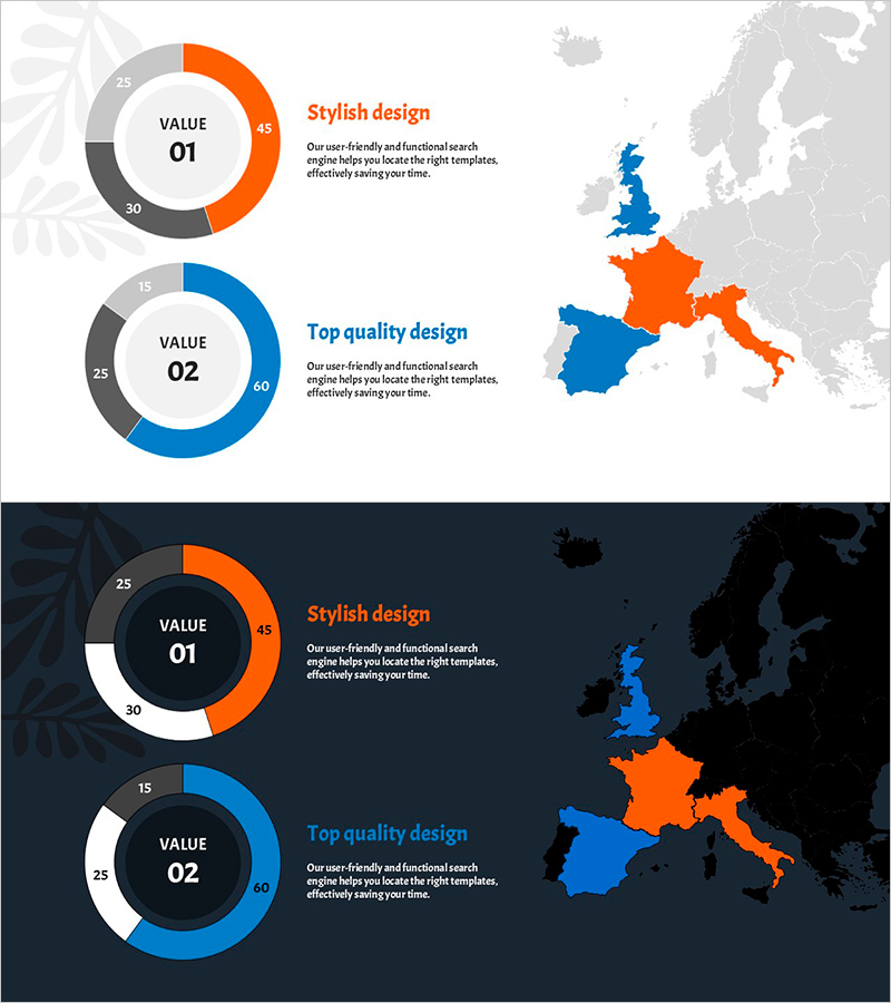
A professional doughnut chart PowerPoint slide designed to visualize market share and data comparisons with clarity and impact. The slide features contrasting orange and blue color segments that effectively represent two-category ratio analysis, with a central VALUE text area for entering key metrics. Paired with a world map layout, this slide is ideal for global market analysis, regional performance comparison, and strategic business presentations. The 16:9 widescreen format includes 2 slides with both light and dark background versions for flexible presentation environments.
Usage Points
-
Main Usage
Effectively communicate market share distribution, sales ratios, customer demographics, and comparative data across two or more categories using circular chart visualization. The central VALUE area allows you to highlight key metrics or titles, emphasizing data importance. Combined with the world map, this slide excels at presenting global market analysis and regional performance comparisons.
-
How to Use
Double-click each doughnut chart segment to input data values, which automatically update the proportional representation. Edit the VALUE 01 and VALUE 02 labels and description text to reflect your analysis categories and insights. Customize the world map country colors to highlight specific regions, and select between light or dark background versions based on your presentation environment and venue lighting.
-
Recommended For
Marketing managers, sales strategy teams, business executives, market analysts, investment presentation specialists, performance report creators, management consultants, and data analysts presenting market conditions, competitive analysis, regional performance metrics, and customer composition breakdowns.
-
Slide Structure
Two-slide set, each containing two doughnut charts with central VALUE text input areas. Each chart is segmented into three color zones (orange, blue, and gray) representing different data categories. A world map is positioned on the right side to support global data representation. Both light background and dark background versions are included for versatile presentation use.
Related Products
-

Geometry PPT Template Wide Map & Doughnut Chart
#Market and Competitor Analysis #Graph #Other
-

Mokup and Turnout Analysis Chart – Analyze with Visual Data
#Market and Competitor Analysis #Graph #Other
-

Donut Chart Slide Visualizing Crime Frequency by Region
#Market and Competitor Analysis #Graph #Other
-

Brown Yellow Regional Analysis – Market Share Visualization
#Market and Competitor Analysis #Graph #Other
