Flower Market Increase/Decrease Graph – Effective Financial Planning
RJ0600108_22
- Last Update 07/20/2025
- File Size 1.1MB
- # of Slides 2
- File Format PPTX
- Slide Ratio 16:9
- Color
Keywords
About the Product
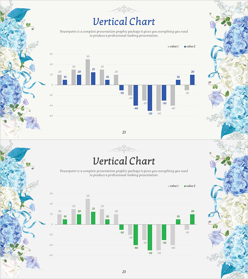
A clustered vertical bar chart PowerPoint slide that displays positive and negative data simultaneously across two series. The design uses blue and gray bars arranged side-by-side for each category, enabling clear comparison of increases and decreases. This slide template is ideal for financial reports, sales performance analysis, market research presentations, and business comparisons. The 2-slide set is optimized for 16:9 widescreen format and ready for immediate use in modern presentation environments.
Usage Points
-
Main Usage
The primary goal is to visualize comparative data containing both positive and negative values with clarity. By placing two data series side-by-side, viewers can instantly grasp differences across categories. This template excels at displaying financial performance, sales fluctuations, market share comparisons, and other business metrics requiring dual-series analysis.
-
How to Use
Use in financial reports to compare quarterly revenue versus expenses, in sales presentations to analyze actual performance against targets, and in marketing decks to benchmark against competitors. The 2-slide format allows you to present the same data from different perspectives or show sequential changes over time periods.
-
Recommended For
Finance managers, marketing strategists, sales directors, and executive presenters benefit most from this template. It's particularly suited for quarterly and annual performance reviews, budget versus actual spending comparisons, product-line sales analysis, and any business presentation requiring quantitative data comparison.
-
Slide Structure
Both slides feature identical layouts with a clustered vertical bar chart centered on a zero baseline. The Y-axis extends both above (positive values in blue and gray) and below (negative values in blue and gray). Approximately 10-12 data categories are displayed with numerical labels above each bar, enabling precise value comparison and easy data reading.
Related Products
-

KPI Target vs Actual Slide – 4-Metric Dark Red & Purple
#Company Introduction #Business Strategy #Financial Plans and Performance
-

(Orange & Green) Bundle Chart and Future Outlook
#Business Strategy #Financial Plans and Performance #Graph
-

Bundled Vertical Bar Graph Blue Green – Market and Customer Analysis
#Market and Competitor Analysis #Financial Plans and Performance #Graph
-

Camera and Vertical Stacked Charts Slide
#Business Strategy #Financial Plans and Performance #Graph
