Comparison of Aurora Observations by Weather
RJ0600107_21
- Last Update 07/20/2025
- File Size 1.3MB
- # of Slides 2
- File Format PPTX
- Slide Ratio 16:9
- Color
Keywords
About the Product
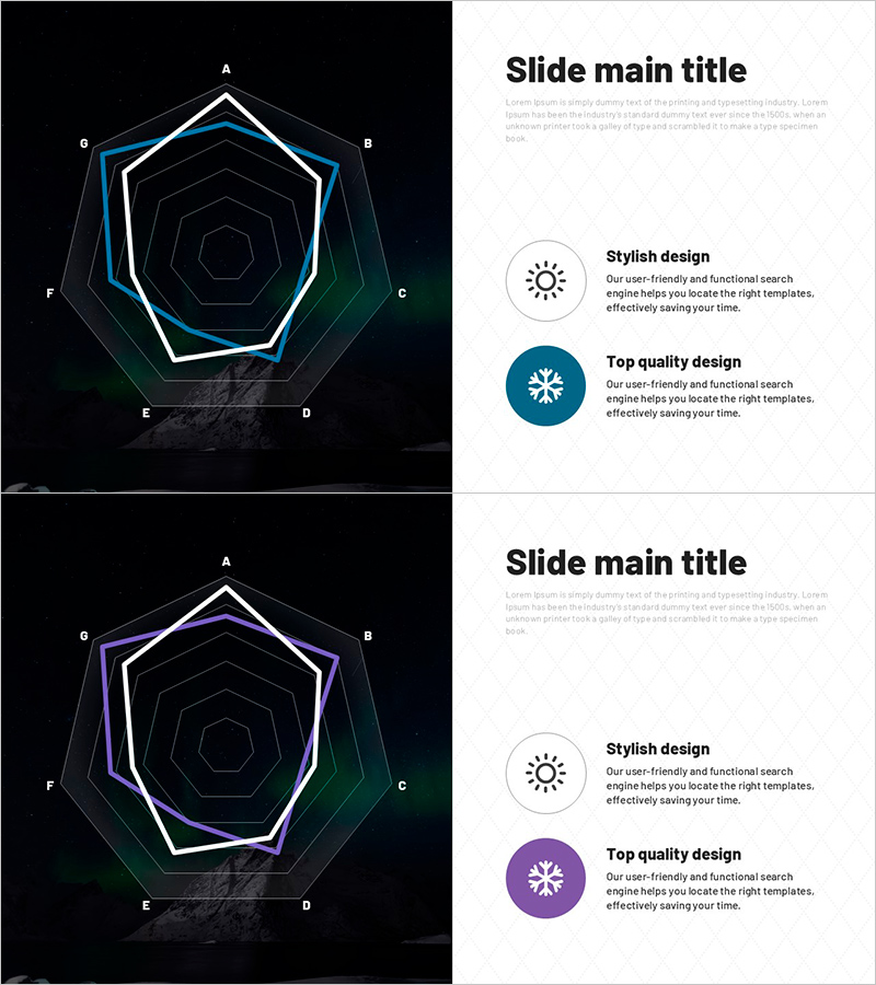
A radial diagram PowerPoint slide with eight nodes radiating from the center, designed for comparing aurora observation data across weather conditions. This presentation template uses a dark background with white, cyan, and green accent lines to emphasize hierarchical structure and relationships between data elements. Ideal for scientific presentations, climate analysis, and environmental data visualization. Includes 2 slides in 16:9 aspect ratio PPTX format, ready to customize and present immediately.
Usage Points
-
Main Usage
Visualizes aurora observation data by comparing weather conditions and showing relationships between multiple variables. The center-radiating structure with eight directional nodes allows simultaneous representation of complex datasets while maintaining clear information hierarchy through layered node arrangement.
-
How to Use
Insert into scientific presentations, climate analysis reports, or environmental research documents in the data comparison section. Enter weather conditions (clear, cloudy, precipitation) and observation metrics into each node, add your topic to the center label, and the slide is ready to use. Modify accent line colors to highlight different data categories.
-
Recommended For
Climatologists, astronomers, environmental researchers, science educators, and data analysts presenting observation results. Suitable for university seminars, academic conferences, environmental policy reports, and science education materials.
-
Slide Structure
2-slide set. Each slide features a center circular node with eight directional nodes (A–H) radiating outward in a multi-layered hexagonal pattern. Dark background with white outline and cyan/green accent lines emphasize hierarchical relationships. Text input areas are positioned at each node and center point for easy customization.
Related Products
-

Fantastic Wide PPT Radar Chart – Visualizing Product Features and Benefits
#Product/Service Introduction #Graph #Product/Service Introduction
-

Breaking Down Performance with Radar Chart – Clear Data Comparison
#Product/Service Introduction #Graph #Features
-

Sailing Travel Risk Management Radar Chart
#Product/Service Introduction #Business Introduction #Diagram
-

Effects and Benefits of Functional Cosmetics – Emphasizing Design
#Product/Service Introduction #Graph #Features
