Blue Purple Line Chart Page – Visualizing Data Trends
RJ0600102_18
- Last Update 07/18/2025
- File Size 0.4MB
- # of Slides 2
- File Format PPTX
- Slide Ratio 16:9
- Color
Keywords
About the Product
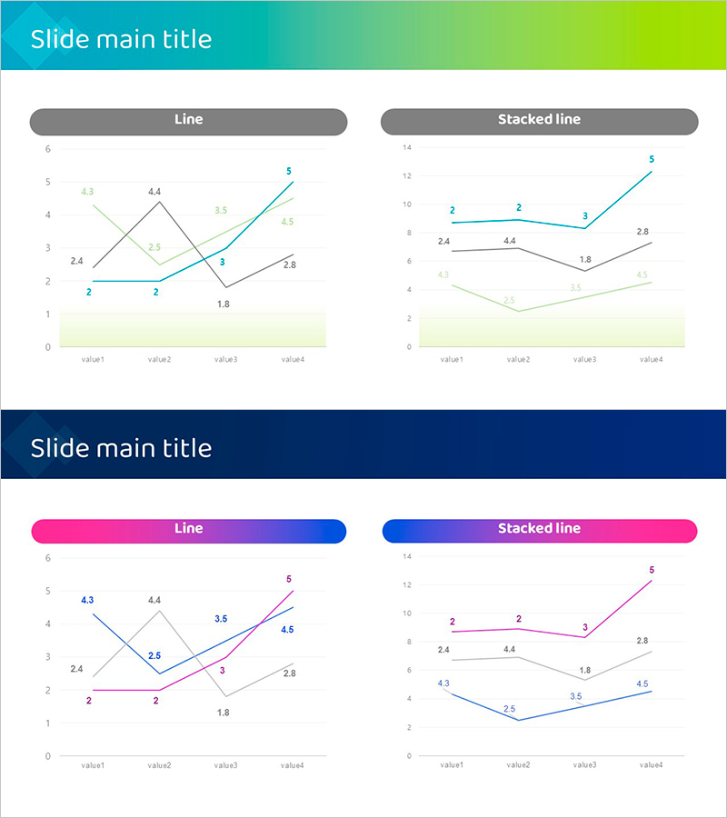
A comprehensive PowerPoint slide set featuring multi-series line charts for data visualization. This 2-slide template includes both standard line chart and stacked line chart formats to represent data trends across four series. The design features a blue-to-purple gradient header with clearly labeled data points and numerical values displayed on each line. The light background and well-defined axes ensure excellent readability for business presentations. Ideal for financial reports, performance analysis, market trend presentations, and quarterly business reviews. Fully editable PPTX format allows you to customize data values, adjust series colors, and adapt the layout to your presentation needs.
Usage Points
-
Main Usage
Visualize and compare multiple data series over time to identify trends, patterns, and correlations. Perfect for displaying sales performance, website analytics, revenue growth, or any metric that changes across multiple categories or time periods.
-
How to Use
Use the standard line chart to emphasize individual series trends independently, or the stacked line chart to show both total volume and component breakdown. Replace sample data with your actual figures, adjust series colors to match your brand guidelines, and modify axis labels as needed for your specific dataset.
-
Recommended For
Financial analysts, business managers, marketing professionals, and data scientists presenting quarterly results, campaign performance, market research findings, or project progress tracking. Suitable for executive presentations, investor reports, and analytical meetings requiring data-driven insights.
-
Slide Structure
Two-slide template: Slide 1 features a standard line chart with 4 series (value1-value4) on a 0-6 scale with individual trend lines. Slide 2 displays the same data as a stacked line chart on a 0-14 scale showing cumulative values. Both slides include a gradient header bar, main chart area, and light background footer section, optimized for 16:9 widescreen format.
Related Products
-

Comparison of Component-Specific Responses According to Conditions
#Business Strategy #Technical Approach #Graph
-

User Analysis Graph by Age Group – Advanced Data Insights
#Market and Competitor Analysis #Diagram #Graph
-

User Analysis Results Diagram - Infographic for Customer Insights
#Market and Competitor Analysis #Graph #Other
-

Achievement of Marketing and Sales Performance – Market Analysis and Vision
#Business Vision and Strategy #Market and Competitor Analysis #Diagram
