Comparison of Component-Specific Responses According to Conditions
RB0400018_3
- Last Update 03/12/2025
- File Size 0.7MB
- # of Slides 2
- File Format PPTX
- Slide Ratio 4:3
- Color
Keywords
- #Content-Based Slides
- #Design-Based Slides
- #Business Strategy
- #Technical Approach
- #Graph
- #Achievements
- #Research and Development
- #Column
- #Grouped Column
- #4:3
- #grouped bar chart PowerPoint
- #comparison chart slide template
- #2-series data visualization
- #component response comparison presentation
- #horizontal bar graph template download
About the Product
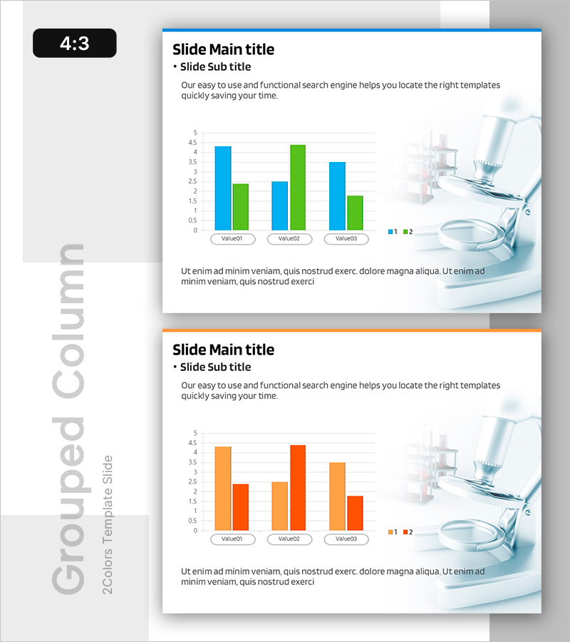
A grouped bar chart PowerPoint slide template for comparing component-specific responses across different conditions. This presentation slide features a horizontal bar chart with two data series displayed in blue and green, comparing three values (Value01, Value02, Value03) side by side for clear visual analysis. Provided as a 2-slide set in 4:3 aspect ratio, this template is ready to use in research reports, technical presentations, and data analysis documents. Each slide includes title, subtitle, and description text areas alongside fully editable chart data for quick customization.
Usage Points
-
Main Usage
Use this slide to compare two or more conditions or data series in research, technical analysis, and marketing reports. It effectively presents multi-item comparisons such as component performance, product benchmarking, market share analysis, and experimental results in a single visual.
-
How to Use
Replace Value01, Value02, and Value03 labels with your data categories and update the bar heights to match your values. Use PowerPoint's built-in chart editing tools to adjust colors, legends, and axis scales. Add your presentation context to the title, subtitle, and description text areas.
-
Recommended For
Ideal for R&D reports, technical presentations, product performance comparisons, marketing analysis, academic presentations, and data-driven decision-making meetings. Particularly suited for science, medical, IT, and manufacturing industries requiring quantitative data visualization.
-
Slide Structure
2-slide set. Each slide contains a title and subtitle area, a horizontal grouped bar chart with 3 items and 2 series (blue and green), a legend, Y-axis scale, and a description text area at the bottom. Fully editable chart elements allow quick data updates.
Related Products
-

Green & Gray Template Wide Growth Graph
#Business Strategy #Graph #Achievements
-

Comparison Bar Graphs and Core Doughnut Charts – Performance Analysis
#Business Introduction #Business Strategy #Graph
-

Blue Orange Growing Bar Graph – Performance and Competitive Edge
#Business Strategy #Market and Competitor Analysis #Graph
-

War Damage Analysis through Graphs
#Business Strategy #Graph #Achievements
