Highlighted Blue Line Chart – Visual Trend Analysis
RJ0600102_17
- Last Update 07/18/2025
- File Size 2.8MB
- # of Slides 2
- File Format PPTX
- Slide Ratio 16:9
- Color
Keywords
About the Product
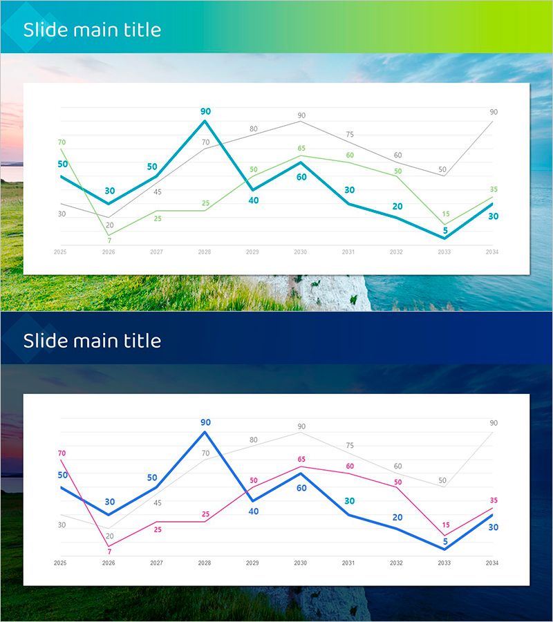
A multi-series line chart PowerPoint slide template comparing data trends across three lines from 2025 to 2034. The slide features a turquoise-to-lime gradient header with a clean white chart area displaying three distinct data series in blue, green, and pink lines. Each data point is labeled with numerical values for precise information delivery. The layout is ideal for business presentations, market analysis reports, financial performance reviews, and strategic planning discussions. The second slide variant uses a navy background with blue and pink line series, offering flexibility for different data visualization needs. Both slides maintain consistent formatting and professional appearance suitable for corporate and analytical presentations.
Usage Points
-
Main Usage
Effectively visualize and compare multiple data series over time, enabling audiences to identify trends, patterns, and performance variations across different metrics simultaneously. Perfect for presenting sales growth, market share evolution, competitive benchmarking, or any longitudinal data analysis requiring multi-line comparison.
-
How to Use
Replace the slide title with your analysis topic in the gradient header area. Update the chart data points and line colors to match your dataset. Clearly label each series in the legend to help viewers understand which line represents which metric. During presentation, use pointer gestures to highlight specific time periods or inflection points to enhance audience engagement and comprehension.
-
Recommended For
Executives, marketing managers, financial analysts, sales directors, business consultants, and data analysts. Suitable for quarterly earnings reports, annual performance reviews, market research presentations, competitive analysis, ROI tracking, budget forecasting, and strategic planning sessions where quantitative trend comparison is essential.
-
Slide Structure
Two-slide set. First slide features a turquoise-to-lime gradient header with title area and a white background chart displaying three line series (blue, green, pink) spanning 2025-2034 with labeled data points. Second slide uses a navy background with the same chart structure but with blue and pink line series, providing design variation for different presentation contexts. All numerical values are displayed at data points for accuracy and clarity.
Related Products
-

Stack Bar Chart Map for Market and Competitor Analysis
#Market and Competitor Analysis #Marketing Plan and Strategy #Graph
-

Technology Status Analysis Graph – Presenting Market Trends
#Market and Competitor Analysis #Financial Plans and Performance #Graph
-

Horizontal Bar Graphs and Analysis – Market and Competitor Analysis
#Market and Competitor Analysis #Graph #Competitive Advantage
-

User Analysis Graph by Age Group – Advanced Data Insights
#Market and Competitor Analysis #Diagram #Graph
