Visualize Market Analysis with Comparison Orange Bar Chart - Identify Competitive Edge
RJ0600100_8
- Last Update 07/18/2025
- File Size 0.4MB
- # of Slides 2
- File Format PPTX
- Slide Ratio 16:9
- Color
Keywords
- #Content-Based Slides
- #Design-Based Slides
- #Market and Competitor Analysis
- #Graph
- #Competitor Analysis
- #Competitive Advantage
- #Column
- #Grouped Column
- #16:9
- #grouped bar chart PowerPoint
- #comparison chart slide template
- #market analysis graph
- #competitive analysis chart
- #how to create bar chart in PowerPoint
About the Product
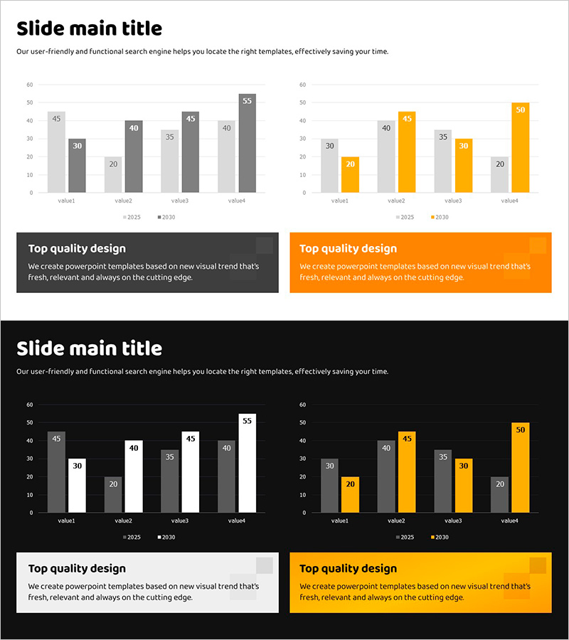
A grouped bar chart PowerPoint slide designed for market analysis and competitive comparison. This presentation template features a side-by-side comparison of 2025 and 2030 data across four metrics, using orange accent color and gray base color to highlight growth trends. Optimized for 16:9 widescreen format with 2-slide composition, ready for immediate use in business presentations and reports. Data values and colors are fully editable for custom analysis.
Usage Points
-
Main Usage
Ideal for visualizing numerical data comparisons in market analysis, competitor benchmarking, and growth trend evaluation. The dual-year or dual-scenario layout enables clear presentation of decision-making evidence and performance metrics.
-
How to Use
Use in business plans, investor pitch decks, marketing proposals, and quarterly reports to compare market size, market share, and performance indicators. Simply update bar heights and values to match your data for immediate deployment.
-
Recommended For
Recommended for executives, marketing managers, sales teams, consultants, and analysts who rely on data-driven decision making. Particularly effective for competitive analysis, market research presentations, and performance evaluation reports.
-
Slide Structure
2-slide set featuring grouped bar charts with 4 data points (value1–value4) per slide. Left chart uses gray tones while right chart emphasizes orange accent color. Legend and value labels are clearly displayed for easy data interpretation.
Related Products
-

Market Competition: Deep Dive into Top 3 Firms
#Market and Competitor Analysis #Graph #Competitor Analysis
-

Four Color Infographic Bar Chart Template – Visualize Your Competitive Advantage
#Market and Competitor Analysis #Graph #Competitor Analysis
-

Sales Status Table and Analysis – Clustered Column Charts for Competitor Analysis
#Market and Competitor Analysis #Graph #Text Box
-

Analyzing 2 Comparison Graphs - Slides for Deriving Competitive Advantage
#Market and Competitor Analysis #Graph #Competitor Analysis
