Analysis by Figures with Horizontal Bar Chart – Data-Driven Market Strategy
RJ0600100_27
- Last Update 07/18/2025
- File Size 0.4MB
- # of Slides 2
- File Format PPTX
- Slide Ratio 16:9
- Color
Keywords
- #Content-Based Slides
- #Design-Based Slides
- #Business Strategy
- #Market and Competitor Analysis
- #Graph
- #Text Box
- #Achievements
- #Market Analysis
- #Column
- #Column Chart
- #Rectangle Text Box
- #16:9
- #vertical bar chart PowerPoint
- #bar graph presentation slide
- #data comparison chart template
- #performance analysis PowerPoint
- #market analysis slide design
About the Product
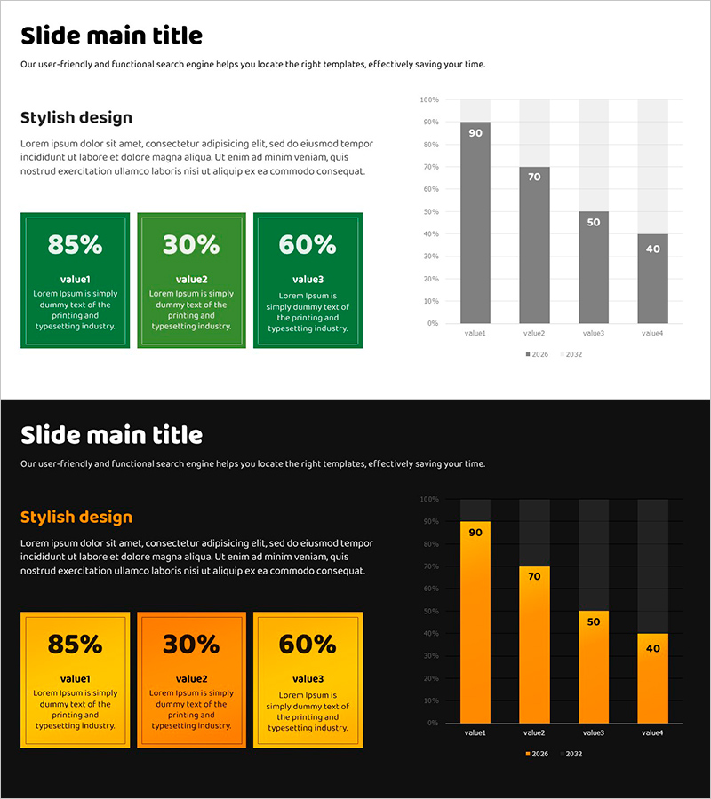
A vertical bar chart PowerPoint slide optimized for market analysis and performance reporting. This presentation template includes 2 design versions (light background and black background) with green and gray dual-tone color scheme. Each slide features 4 data items with a left-side layout of 3 rectangular text boxes (showing 85%, 30%, 60% examples) to highlight key metrics, and a right-side vertical bar chart displaying 2-year trend comparison (2026 vs 2032). The slide structure enables clear visualization of quantitative data for business presentations, reports, and strategic discussions. Fully editable PPTX format ready for immediate customization.
Usage Points
-
Main Usage
Visualize quantitative data to support market analysis, performance comparison, and business strategy presentations with data-driven insights. The 4-item year-over-year trend display clearly communicates changes and comparative metrics across multiple data points.
-
How to Use
Enter key metrics (percentages, figures, or indicator names) in the left-side rectangular text boxes, then update the vertical bar chart data values to reflect your actual statistics. Use the light background version for printing and PDF distribution, and the black background version for projector presentations.
-
Recommended For
Ideal for quarterly and annual performance reports by finance, marketing, and strategy teams; market research presentations; executive briefings; investor pitch decks; and business planning presentations. Recommended for any business presentation requiring data-driven decision-making and comparative analysis.
-
Slide Structure
Each slide contains a title area, 3 left-side rectangular text boxes (editable for metrics and labels), and a right-side vertical bar chart with 4 data items across 2 year series. The chart legend is positioned at the bottom with color differentiation: green for primary metrics and gray for comparative metrics.
Related Products
-

Business Performance Analysis Vertical Bar Graph – Performance and Strategy
#Business Strategy #Market and Competitor Analysis #Graph
-

Analysis of Factors Contributing to Excellent Sales Performance – Visualizing Success
#Business Strategy #Financial Plans and Performance #Graph
-

Touch Wide Slide Template for Market Analysis with Vertical Column Chart
#Business Strategy #Market and Competitor Analysis #Graph
-

Visualizing Achievements through Design Innovation – Reflecting Latest Trends
#Business Strategy #Market and Competitor Analysis #Diagram
