Data Visualization Presentation Slide Using Line Charts
RJ0600098_23
- Last Update 07/17/2025
- File Size 0.2MB
- # of Slides 2
- File Format PPTX
- Slide Ratio 16:9
- Color
Keywords
About the Product
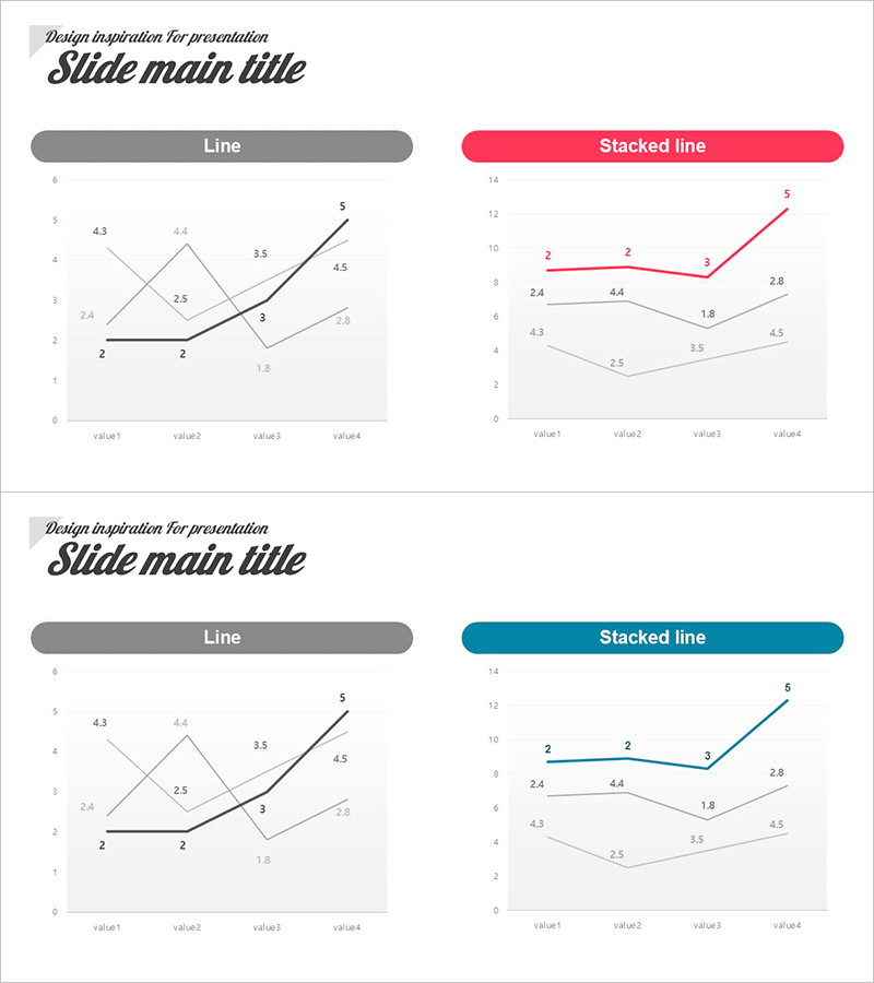
This free PowerPoint slide features a side-by-side two-column layout with a standard Line chart on the left and a Stacked Line chart on the right, both set against a clean white background with light gray gridlines. Two color versions are included in a single file: a pink-red accent version and a teal-blue accent version, allowing you to choose the style that best fits your presentation tone. Each chart displays three data series across four measurement points (value1–value4), with data labels printed directly on the chart for instant readability. The slide is ideal for visualizing time-series trends, quarterly performance comparisons, or multi-series data analysis in business reports, marketing plans, or pitch decks. Simply replace the data values and title text to make it your own. Explore more graph and chart PPT slides at GoodPello.
Usage Points
-
Main Usage
Designed to visualize time-series trends and multi-series data comparisons in a single slide. The side-by-side placement of a Line chart and a Stacked Line chart allows presenters to show both individual trends and cumulative patterns simultaneously within one data analysis section.
-
How to Use
Replace the numeric data values in both charts with your actual figures, update the slide title to match your presentation topic, and select either the pink-red or teal-blue color version to suit your overall deck style. No advanced design skills are required.
-
Recommended For
Business professionals, data analysts, and planners who need to present quarterly performance reports, annual sales trends, or multi-variable comparisons in business reports, business plans, or marketing strategy decks will find this slide immediately useful.
-
Slide Structure
Single-slide layout with two charts side by side: Line chart (left, dark gray header bar) and Stacked Line chart (right, color header bar). Each chart contains three data series across four data points with direct data labels. Two color versions (pink-red and teal-blue) are included in one file.
Related Products
-

Competitive Advantage Analysis Bar Chart – Data Visualization
#Free Graphs
-

Business Comparison Analysis Graph – Strengthening Market and Competitor Analysis
#Free Graphs
-

Market Analysis by Year Horizontal Bar Graph
#Free Graphs
-

Tree Yellow Purple Area Chart – Innovation in Data Visualization
#Free Graphs
