Purple Orange Curved Line Chart – Visualizing Competitive Edge
RJ0600094_14
- Last Update 07/16/2025
- File Size 0.4MB
- # of Slides 2
- File Format PPTX
- Slide Ratio 16:9
- Color
Keywords
- #Content-Based Slides
- #Design-Based Slides
- #Market and Competitor Analysis
- #Graph
- #Competitor Analysis
- #Competitive Advantage
- #Line
- #Line Chart
- #16:9
- #line chart PowerPoint
- #dual-series chart template
- #trend analysis slide
- #competitive analysis PPT
- #market performance comparison
- #PowerPoint graph slide design
About the Product
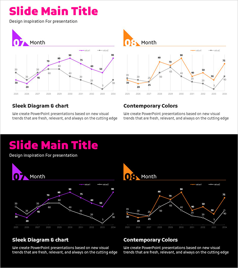
A professional dual-series line chart PowerPoint slide designed for competitive analysis and market performance comparison. Two data series represented in purple and orange colors visualize trends from 2025 to 2034, with precise numerical labels at each data point for accurate value comparison. Gray gridlines create a structured background for easy data reading and interpretation. Two design versions are provided—light background and dark background—allowing you to match your presentation environment. This slide is ready to use in executive reports, market analysis presentations, competitive positioning decks, and strategic planning meetings. Simply replace the sample data with your actual figures to create a professional trend analysis slide.
Usage Points
-
Main Usage
Simultaneously compare two competing metrics or performance indicators over an extended period. Ideal for visualizing company growth versus competitors, market share evolution, revenue trends, or any dual-metric analysis essential for executive decision-making and strategic planning.
-
How to Use
Use in executive presentations, quarterly performance reviews, strategic planning sessions, and investor relations meetings to explain market dynamics and competitive advantages. Edit the numerical values to input your actual data, adjust colors and legend labels as needed, and optionally add additional data series by duplicating the line elements.
-
Recommended For
Executives, marketing managers, strategy planners, sales directors, financial analysts, and business intelligence professionals presenting competitive analysis, market performance, and business growth metrics. Particularly effective for quarterly/annual performance reports, competitive positioning analysis, and market entry strategy presentations.
-
Slide Structure
Two-slide set, each featuring a dual-series line chart. X-axis displays years 2025–2034, Y-axis shows numerical scale 0–90. Purple and orange series each contain 10 data points with value labels. Title and legend positioned at the top. One slide with light background and one with dark background for flexible presentation context.
Related Products
-

Mobile Service Technology Analysis Graph – Market and Competitor Analysis
#Market and Competitor Analysis #Diagram #Graph
-

Comparative Analysis Line Graph – Highlighting Competitive Advantage
#Market and Competitor Analysis #Graph #Competitor Analysis
-

Competitor Comparison Broken Line Highlight Graph
#Market and Competitor Analysis #Graph #Competitor Analysis
-

Market Competitiveness Comparison Graph – Highlighting Competitive Advantage
#Market and Competitor Analysis #Graph #Competitor Analysis
