Premium Design Infographic – Top Quality
RJ0600093_23
- Last Update 07/16/2025
- File Size 1.5MB
- # of Slides 2
- File Format PPTX
- Slide Ratio 16:9
- Color
Keywords
About the Product
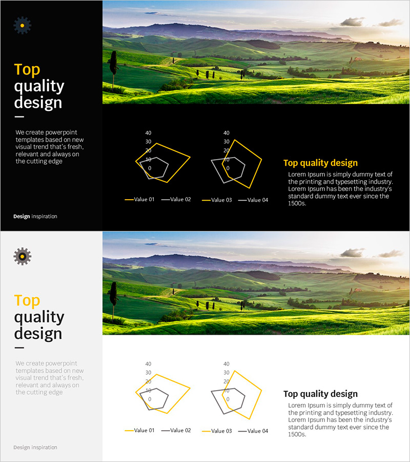
A data visualization PowerPoint slide featuring a radial diagram that expands from center to periphery, enabling simultaneous comparison of four items. This presentation template includes two versions of radial charts (gold line and white line) where you can input values up to 40 points for each item, automatically displaying results in polygon form. Ideal for business reports, performance analysis, competency assessment, and various presentation scenarios requiring immediate deployment.
Usage Points
-
Main Usage
Optimized for simultaneous comparison of four numerical values and visual representation of strengths and weaknesses. Perfect for organizational competency evaluation, product feature comparison, performance metrics analysis, and any presentation requiring multi-dimensional polygon comparison charts.
-
How to Use
Input numerical values (0-40 points) for each item and the diagram automatically renders in polygon form. Gold line version suits premium business reports; white line version works for clean corporate presentations. All colors and values are fully editable.
-
Recommended For
Executive reports, organizational competency assessment, product performance comparison, marketing analysis, consulting proposals, training seminar materials. Recommended for executives, planners, analysts, marketers, and training professionals requiring quantitative comparisons.
-
Slide Structure
2-slide set. Slide 1: Gold line radial diagram with 4 items (Value 01-04 labeled, 40-point scale). Slide 2: Identical structure with white line. 16:9 widescreen format, PPTX file with fully editable values and colors.
Related Products
-

Natural Radial Chart – Visualizing Business and Service Attributes
#Product/Service Introduction #Diagram #Graph
-

Radar Chart for Supplements Presentation
#Product/Service Introduction #Graph #Features
-

Natural Environment Radar Chart – Emphasizing Vitality and Harmony
#Product/Service Introduction #Graph #Features
-

Motion Radar Chart for Effective Data Visualization
#Product/Service Introduction #Graph #Features
