Trends in the Number of Professional Tennis Spectators – Performance and Competitive Advantage
RJ0600065_14
- Last Update 07/07/2025
- File Size 1.6MB
- # of Slides 2
- File Format PPTX
- Slide Ratio 16:9
- Color
Keywords
About the Product
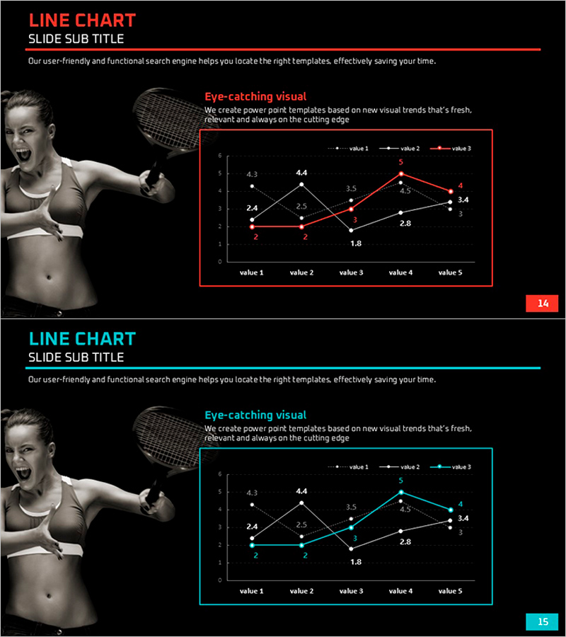
A multi-series line chart PowerPoint slide visualizing professional tennis spectator trends across three data series. The design features a black background with red, white, and cyan lines tracking five data points, each labeled with precise numerical values for accurate comparison. The 16:9 widescreen format includes two slides ready for performance analysis, competitive benchmarking, and market trend presentations in business reports and executive briefings.
Usage Points
-
Main Usage
Ideal for comparing multiple data series over time, such as tracking competitive performance metrics, market trends, or KPI changes. The three-line structure enables simultaneous visualization of related indicators, making it effective for demonstrating growth patterns, market share shifts, or performance benchmarking across different categories.
-
How to Use
Retain the color scheme or customize lines to match corporate branding. Replace data point values with your actual figures and update axis labels and legend text to fit your presentation context. Insert into performance reports, quarterly reviews, investor presentations, or strategic planning sessions where trend comparison is essential.
-
Recommended For
Executives, marketing teams, sales analysts, management consultants, and business strategists presenting quarterly results, competitive analysis, market penetration data, or multi-metric performance dashboards. Suitable for board meetings, investor relations, market research presentations, and strategic business reviews.
-
Slide Structure
Two-slide set with black background. Each slide displays three line series (red, white, cyan) connecting five data points labeled value 1 through value 5. Y-axis ranges 0–6 with gridlines; X-axis shows five categories. Data point values (2.4, 4.3, 4.4, etc.) are labeled at each intersection. Legend identifies the three series. Title and subtitle areas included.
Related Products
-

Functional Cosmetics Market Size Graph – Growth and Opportunities
#Business Strategy #Market and Competitor Analysis #Graph
-

American Football Match Performance Status – Highlighting Competitive Advantage
#Business Strategy #Market and Competitor Analysis #Graph
-

The Population Graph of Animals and Plants – Visualizing Competitive Advantage
#Business Strategy #Market and Competitor Analysis #Diagram
-

Graph for Economic Growth and Competitive Advantage Visualization
#Business Strategy #Market and Competitor Analysis #Graph
