Three-Color Line Chart - Visualizing Competitive Advantage
RJ0600090_16
- Last Update 07/14/2025
- File Size 1.7MB
- # of Slides 2
- File Format PPTX
- Slide Ratio 16:9
- Color
Keywords
About the Product
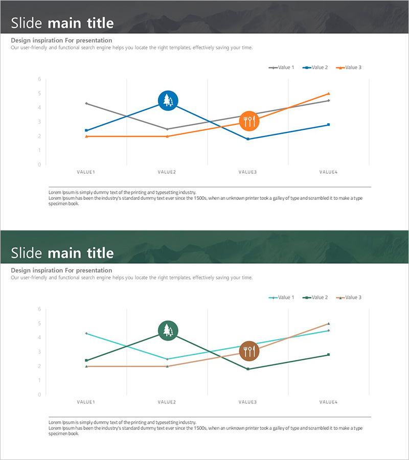
A PowerPoint slide featuring a multi-line chart with three data series visualized in gray, blue, and orange. The chart tracks changes across four data points (VALUE1 through VALUE4), making it ideal for comparing competitor performance, market share trends, and sales metrics simultaneously. Each series is marked with a circular icon at key data points to emphasize critical insights. The slide includes a legend and axis labels for clear information hierarchy. Two-slide variation provides flexibility in color combinations and presentation contexts.
Usage Points
-
Main Usage
Simultaneously compare multiple quantitative metrics over time using a multi-line chart format. Ideal for visualizing competitor performance, market share evolution, sales trends, customer satisfaction changes, and market response metrics in a single integrated view.
-
How to Use
Deploy in business strategy presentations, market analysis reports, and quarterly performance reviews to demonstrate competitive positioning. Customize series colors and legend labels to match your data, update axis values and data points, and add contextual descriptions to create a ready-to-present slide.
-
Recommended For
Executives, marketing teams, sales departments, and strategic planning units presenting competitive analysis to stakeholders, investors, and clients. Particularly effective when comparing market share evolution, product performance benchmarks, customer satisfaction trends, and multi-dimensional competitive metrics.
-
Slide Structure
Two-slide deck with identical layouts. Each slide displays three trend lines (gray, blue, orange) tracking four data points. Circular icons highlight key inflection points on each series. Legend positioned top-right, Y-axis scale on left, X-axis labels (VALUE1-VALUE4) at bottom. Title area at top, descriptive text area at bottom for context.
Related Products
-

Accumulated Line Chart – Market and Competitor Analysis
#Market and Competitor Analysis #Financial Plans and Performance #Graph
-

Vegetable Market Status Analysis with Line Charts
#Market and Competitor Analysis #Graph #Market Status
-

Brown Blue Detailed Analysis Chart - Market and Competitor Analysis
#Market and Competitor Analysis #Diagram #Graph
-

Annual Investment Analysis Graph – Competitor Analysis and Cluster Visualization
#Market and Competitor Analysis #Diagram #Graph
