Broken Line Comparison Graph – Optimized for Market and Competitor Analysis
RJ0300050_15
- Last Update 05/01/2025
- File Size 1MB
- # of Slides 2
- File Format PPTX
- Slide Ratio 16:9
- Color
Keywords
- #Content-Based Slides
- #Design-Based Slides
- #Market and Competitor Analysis
- #Graph
- #Competitor Analysis
- #Competitive Advantage
- #Line
- #Line Chart
- #16:9
- #line chart PowerPoint
- #dual-series trend comparison slide
- #market analysis graph
- #competitor analysis template
- #data visualization PowerPoint
- #how to create line chart in PowerPoint
About the Product
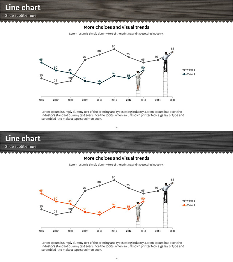
A multi-series line chart PowerPoint slide comparing two data trends from 2006 to 2030 across 12 data points. The template features a gray header section and white content area, with two slide variations: the first uses black line series, and the second uses orange accent coloring to highlight the same data from different perspectives. Each slide includes axis labels, legend, and descriptive text space for immediate use in market analysis, competitor benchmarking, and performance reporting presentations. The 16:9 widescreen format (2 slides, PPTX) is fully editable for customization.
Usage Points
-
Main Usage
Visualizes long-term trend changes and multi-series comparisons with clarity. Ideal for displaying market size evolution, competitor performance benchmarking, quarterly or annual revenue trends, customer satisfaction changes, and any two-metric time-series analysis requiring side-by-side comparison.
-
How to Use
Slide 1 features standard black line series; Slide 2 uses orange accent coloring for emphasis. Replace the 12 data points (2006–2030) with your actual figures, update axis labels and legend text to match your presentation context, and add analysis insights in the description area. All elements are fully editable in PowerPoint.
-
Recommended For
Executive reports, business plans, investor pitch decks (IR), marketing strategy presentations, quarterly earnings reports, competitive analysis documents, and market research findings. Recommended for executives, business analysts, strategists, marketing professionals, and data-driven decision makers.
-
Slide Structure
Each slide consists of a gray header (title area) and white content zone. The dual-series line chart occupies the center (12 data points, X-axis: years, Y-axis: values) with a legend (Value 1, Value 2) positioned on the right. A descriptive text area at the bottom allows for chart interpretation and key insights.
Related Products
-

Default Line Graph for Market & Competitor Analysis – Competitive Advantage
#Market and Competitor Analysis #Graph #Competitor Analysis
-

Competition Graphs and Analysis – Slides for Market Advantage
#Market and Competitor Analysis #Graph #Competitor Analysis
-

Blue Green Broken Line Graph – Competitor Analysis
#Market and Competitor Analysis #Graph #Competitor Analysis
-

Modern Theme Competitor Analysis Graph
#Market and Competitor Analysis #Graph #Competitor Analysis
