Weather Bar Subdivision Graph - Innovative Market Analysis
RJ0600089_11
- Last Update 07/14/2025
- File Size 0.6MB
- # of Slides 2
- File Format PPTX
- Slide Ratio 16:9
- Color
Keywords
- #Content-Based Slides
- #Design-Based Slides
- #Technical Approach
- #Market and Competitor Analysis
- #Graph
- #Innovative Technologies and Future Plans
- #Industry Trends
- #Column
- #Segmented Column
- #16:9
- #vertical stacked bar chart PowerPoint
- #subdivided bar graph slide
- #multi-series data comparison
- #market analysis chart template
- #how to create stacked bar chart in PowerPoint
About the Product
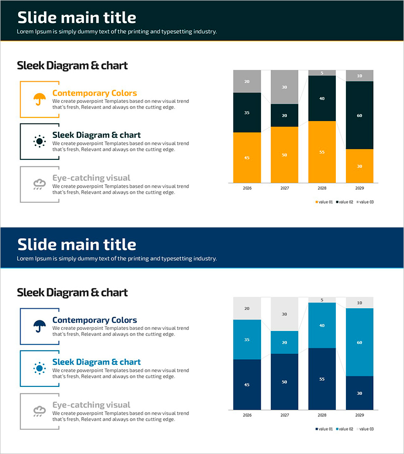
A PowerPoint slide template featuring a vertical stacked bar chart with 4 data series displayed across 4 years (2026–2029). The chart uses orange, dark navy, and gray color segments to represent subdivided data, making it ideal for market trend analysis, competitive benchmarking, and sales performance comparison. Each bar is segmented into 4 sections to show the contribution of individual components at a glance. The slide includes explanatory text boxes on the left side and is fully editable, allowing you to input your own data and create professional presentation materials instantly.
Usage Points
-
Main Usage
Visualizes multi-dimensional data across time periods or categories by stacking multiple data series in a single bar. This format simultaneously displays total volume and component composition, making it effective for market share analysis, revenue breakdown, cost allocation, and year-over-year comparisons.
-
How to Use
Insert this slide into business reports, marketing plans, or financial analysis presentations in the data visualization section. Replace the sample numbers and labels with your actual data, and adjust colors if needed. The chart clearly communicates trends and comparisons during presentations, helping audiences understand complex data relationships.
-
Recommended For
Marketing managers, financial analysts, business strategists, management consultants, and sales directors benefit from this template when presenting market analysis, performance reports, and strategic initiatives. It is particularly valuable for executive briefings, investor presentations, and internal meetings where data credibility and clarity are essential.
-
Slide Structure
The 2-slide set presents vertical stacked bar charts with 4 years of data (2026–2029) on each slide. Each bar is divided into 4 colored segments (orange, dark navy, gray, light gray) representing different data categories. Numerical labels appear above each segment, and a legend identifies the data series. Explanatory text boxes on the left provide context for the chart.
Related Products
-

Real Estate Market Trends Chart – Data Analysis and Performance
#Business Strategy #Market and Competitor Analysis #Graph
-

Comparison Chart of Pet Expenditure – Essential Template for Competitor Analysis
#Market and Competitor Analysis #Diagram #Graph
-

Red Green Market Analysis Slide – Effective Data Visualization
#Business Strategy #Market and Competitor Analysis #Diagram
-

Simple Design Trend Wide PPT Radar Chart
#Technical Approach #Market and Competitor Analysis #Graph
