Visualizing Environmental Protection Practice Survey with Pie Chart – A Sustainable Future
RJ0600088_12
- Last Update 07/14/2025
- File Size 0.4MB
- # of Slides 2
- File Format PPTX
- Slide Ratio 16:9
- Color
Keywords
- #Content-Based Slides
- #Design-Based Slides
- #Market and Competitor Analysis
- #Graph
- #Market Share
- #Circles
- #Pie Chart
- #16:9
- #pie chart PowerPoint slide
- #circular graph template
- #environmental survey visualization
- #data visualization presentation
- #percentage chart slide
- #survey results template download
About the Product
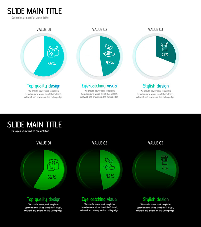
A PowerPoint slide that visualizes environmental protection practice survey data using three pie charts. The circular charts feature a two-tone turquoise color scheme—light and dark teal—with icons and percentage values positioned at the center of each segment for intuitive data representation. The 2-slide set enables side-by-side comparison of multiple survey items and is optimized for 16:9 widescreen presentations. Perfect for sustainability reports, environmental policy presentations, market research findings, and CSR initiatives that require clear ratio-based data visualization.
Usage Points
-
Main Usage
Clearly present survey data, market share, and percentage-based statistics using three pie charts. Compare environmental protection practice rates, sustainability awareness levels, and policy approval ratings simultaneously. Each chart includes descriptive text below to highlight key insights and support data-driven storytelling.
-
How to Use
Use in corporate sustainability reports, environmental policy presentations, CSR initiatives, and market research briefings. Simply replace the chart data and labels with your own survey results, then adjust colors and text to match your brand guidelines. Both light and dark background versions are included for flexible presentation contexts.
-
Recommended For
Environmental professionals, sustainability specialists, marketing and PR teams, policymakers, academic researchers, and nonprofit advocates presenting quantitative survey findings. Ideal for situations requiring comparative analysis and data-backed persuasive communication.
-
Slide Structure
Slide 1: Title section with 3 pie charts arranged horizontally (VALUE 01–03). Each chart displays a two-segment division in light and dark turquoise with centered percentage values and icons. Slide 2: Identical layout on black background for contrast. Full 16:9 widescreen format, PPTX file type, fully editable.
Related Products
-

Human Analysis Chart – Visualizing Customer Analysis and Market Share
#Market and Competitor Analysis #Graph #Other
-

Market Share Analysis Graph – Effective Market Insights
#Market and Competitor Analysis #Graph #Market Share
-

Chart Analysis of Aerobic Exercise – Market Share Visualization
#Market and Competitor Analysis #Diagram #Graph
-

Pie Chart by User – Customer Analysis and Market Share
#Market and Competitor Analysis #Graph #Customer Analysis
