Visualizing Use of Transportation for Overseas Travel – Market Status Analysis
RJ0600085_7
- Last Update 07/13/2025
- File Size 0.7MB
- # of Slides 2
- File Format PPTX
- Slide Ratio 16:9
- Color
Keywords
About the Product
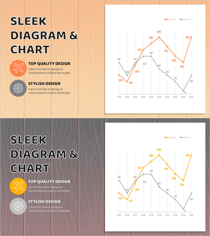
A PowerPoint slide featuring a dual-series line chart that compares two data trends over a 10-year period from 2025 to 2034. Orange and black lines represent distinct data sets, with each data point clearly labeled with numerical values for precise comparison. The minimalist grid background enhances readability and focuses attention on the trend patterns. This slide template is ideal for visualizing market analysis, sales performance, customer satisfaction metrics, and other time-series data in business presentations, reports, and strategic planning documents.
Usage Points
-
Main Usage
Compares two or more data series over time to identify trends, patterns, and correlations. Effectively communicates sales growth, market share changes, customer satisfaction evolution, and competitive positioning. Ideal for executive presentations, marketing strategy documents, business analysis reports, and investor communications where tracking multiple key performance indicators simultaneously is essential.
-
How to Use
Input your actual data values into the chart by editing the data table linked to the slide. The orange line represents the primary metric while the black line shows the comparison metric. Update the numerical labels at each data point to reflect your specific values. Customize the chart title, axis labels, and legend to match your presentation context. The chart automatically adjusts as you modify the underlying data.
-
Recommended For
Business executives, marketing managers, sales directors, data analysts, and management consultants presenting quarterly or annual performance reviews, market trend analysis, competitive benchmarking, and strategic forecasts. Suitable for investor presentations, board meetings, client proposals, and internal stakeholder communications where comparative trend analysis is critical.
-
Slide Structure
Two line series with 10 data points each spanning 2025–2034. Orange series ranges from 30 to 90, black series from 10 to 60, with all values labeled at each point. Clean grid lines and a legend clearly distinguish the two data sets. Optimized for 16:9 widescreen format with ample white space for professional presentation impact.
Related Products
-

Vegetable Market Status Analysis with Line Charts
#Market and Competitor Analysis #Graph #Market Status
-

Comparison of Change Curves – Market and Competitor Analysis
#Market and Competitor Analysis #Graph #Market Status
-

Blue Green Basic Line Chart – Market Status and Competitive Analysis
#Market and Competitor Analysis #Graph #Market Status
-

Interior Template Line Chart – Market Trends and Competitive Advantage
#Market and Competitor Analysis #Graph #Market Status
