Vegetable Market Status Analysis with Line Charts
RJ0600054_18
- Last Update 07/05/2025
- File Size 2.5MB
- # of Slides 2
- File Format PPTX
- Slide Ratio 16:9
- Color
Keywords
About the Product
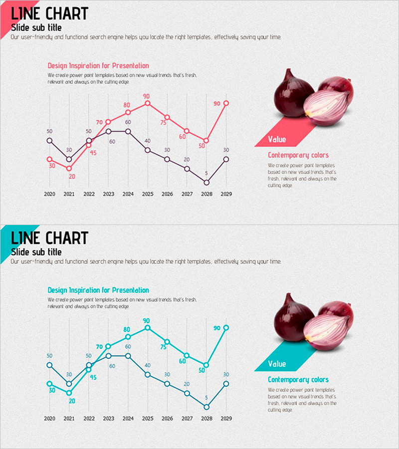
A dual-series line chart PowerPoint slide designed to visualize and compare data trends over time. This presentation template displays 10 years of market data (2020–2029) using two contrasting lines in pink and black, with numeric labels at each data point for precise value communication. The right side features a color reference box and descriptive text area to enhance presentation context. Ideal for business presentations including market analysis, competitive benchmarking, performance reporting, and strategic planning. The slide is fully editable and ready for immediate use in professional presentations.
Usage Points
-
Main Usage
Optimized for comparing two or more data series over time and highlighting trend changes. Perfect for visualizing market conditions, sales performance, customer satisfaction, competitive metrics, and other time-series data. Numeric labels on each data point ensure accurate value communication and support data-driven decision-making.
-
How to Use
Place this slide in the market analysis, performance reporting, or competitive analysis section of your presentation. Use the pink line for primary metrics and the black line for comparison targets, or customize colors and values to match your actual data. Edit the color reference box on the right to add legends or supplementary insights for enhanced presentation impact.
-
Recommended For
Recommended for marketing plans, business reports, investor pitch decks, and product performance analysis presentations. Ideal for market researchers, sales managers, executives preparing board reports, consultants, and business analysts who need to support data-driven narratives with clear visual comparisons.
-
Slide Structure
Two-slide set, each featuring a dual-series line chart with a 10-year timeline (2020–2029) as the primary element. The graph area with grid background occupies the left side, while the right side includes a pink accent box, color reference chips, and text description area for balanced data and interpretation delivery.
Related Products
-

Comparison of Change Curves – Market and Competitor Analysis
#Market and Competitor Analysis #Graph #Market Status
-

Interior Template Line Chart – Market Trends and Competitive Advantage
#Market and Competitor Analysis #Graph #Market Status
-

Work Stress Visualized with Line Chart – Analysis and Competitive Advantage
#Market and Competitor Analysis #Graph #Market Status
-

Visualizing Use of Transportation for Overseas Travel – Market Status Analysis
#Market and Competitor Analysis #Graph #Market Status
