The Population Graph of Animals and Plants – Visualizing Competitive Advantage
RJ0600084_7
- Last Update 07/13/2025
- File Size 0.5MB
- # of Slides 2
- File Format PPTX
- Slide Ratio 16:9
- Color
Keywords
- #Content-Based Slides
- #Design-Based Slides
- #Business Strategy
- #Market and Competitor Analysis
- #Diagram
- #Graph
- #Achievements
- #Competitive Advantage
- #Line
- #Line Chart
- #16:9
- #line chart PowerPoint
- #dual-series graph slide
- #time-series data visualization
- #trend analysis presentation
- #how to create line chart in PowerPoint
About the Product
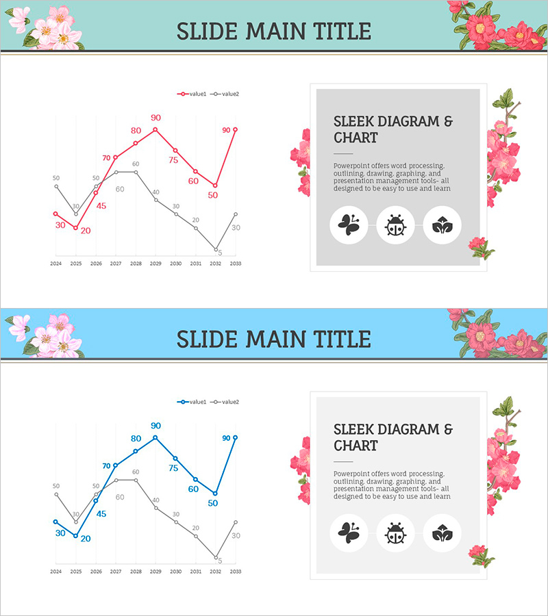
A PowerPoint slide template featuring a dual-series line chart that visualizes time-series data from 2024 to 2033. The chart displays population trends of animals and plants across a 10-year period using pink and black color schemes, with precise numerical values marked at each data point for accurate comparison. This presentation slide is ideal for market analysis, competitive advantage assessment, and trend reports where temporal changes need to be emphasized. The 16:9 widescreen format includes 2 fully editable slides.
Usage Points
-
Main Usage
Designed to compare and analyze changes in two data series over time simultaneously. Effectively visualizes patterns such as growth, decline, and fluctuations in animal populations, sales figures, market share, or customer satisfaction metrics, enhancing audience comprehension.
-
How to Use
Use in business reports, market analysis documents, management performance presentations, and trend reports to explain performance changes over time. Maintain the pink and black color scheme or customize with your corporate brand colors for seamless integration into your presentation.
-
Recommended For
Ideal for executives, marketing professionals, data analysts, consultants, and academic presenters explaining performance metrics, market changes, and long-term trends. Particularly effective for competitive analysis, market evolution discussions, and highlighting sustained performance trajectories.
-
Slide Structure
Comprises a dual-series line chart with value1 and value2 plotted against a 10-year timeline (2024–2033) on the X-axis and a 0–90 numerical range on the Y-axis. Each data point displays precise values (30, 45, 60, 70, 80, 90, etc.) ensuring numerical accuracy. Includes legend, title, and descriptive text areas.
Related Products
-

Competitor Comparison Graph & Table - Essential Tool for Market Analysis
#Market and Competitor Analysis #Diagram #Competitor Analysis
-

Service Analysis Line Graph – Visualization of Competitive Advantage
#Market and Competitor Analysis #Diagram #Graph
-

Data Trend Analysis with Line Chart – Professional Insight and Visual Inspiration
#Business Strategy #Marketing Plan and Strategy #Diagram
-

Analysis of Reading Volume by Data – Market Status and Competitive Advantage
#Market and Competitor Analysis #Diagram #Graph
